There is considerable interest in wireless networks equipped with intelligent reflecting surfaces (IRSs), aka reconfigurable intelligent surfaces or smart reflecting surfaces. While everyone agrees that IRSs can enhance the signal over a desired link, there are conflicting views about whether IRSs matched to a certain receiver causes interference at other receivers. The purpose of this blog is to clarify this point.
To this end, we focus on a downlink cellular setting where BSs form a stationary point process Φ and a user and a passive IRS with N elements are placed in each (Voronoi) cell. The exact distribution is irrelevant for our purposes. The desired signal at each user consists of the direct signal from its BS plus the intelligently reflected signal at its IRS. The SIR of a user at the origin served by the BS at x0 can be expressed as
where ℓ(x0) is the path loss from the serving BS and
Here the random variables g0 and gi capture the (amplitude) fading over the direct link and reflected (indirect) link respectively, and the triangle parameter Δ captures the distances in the BS-IRS-user triangle. For details, please see this paper. The pertinent question is what constitutes the interference I. If all BSs are active, their interference is
But how about the IRSs? This is where it becomes contentious. Some argue that the IRSs emit signals and thus cause extra interference that is not captured in this sum over the BSs only. This would mean that we need to add a sum over the IRSs of the form
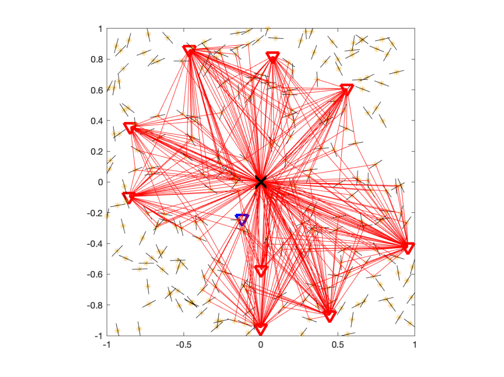
where Ψ is the point process of IRSs and pz is the power emitted by the IRS located at z. To decide whether Q is real or fake, let us have a look at the underlying network model. With fading modeled as Rayleigh, it is understood that the propagation of all signals is subject to rich scattering, i.e., there is multi-path propagation. For the case without IRSs, the propagation of interfering signals is illustrated here:
Figure 1. Propagation in a rich scattering environment without IRSs.
Figure 1 shows the user at the origin, its serving BS (blue triangle), and the interfering BSs (red triangles). The small black lines indicate scattering and reflecting objects. Some of the paths from interfering BSs via scattering objects to the user are shown with 319 red lines.
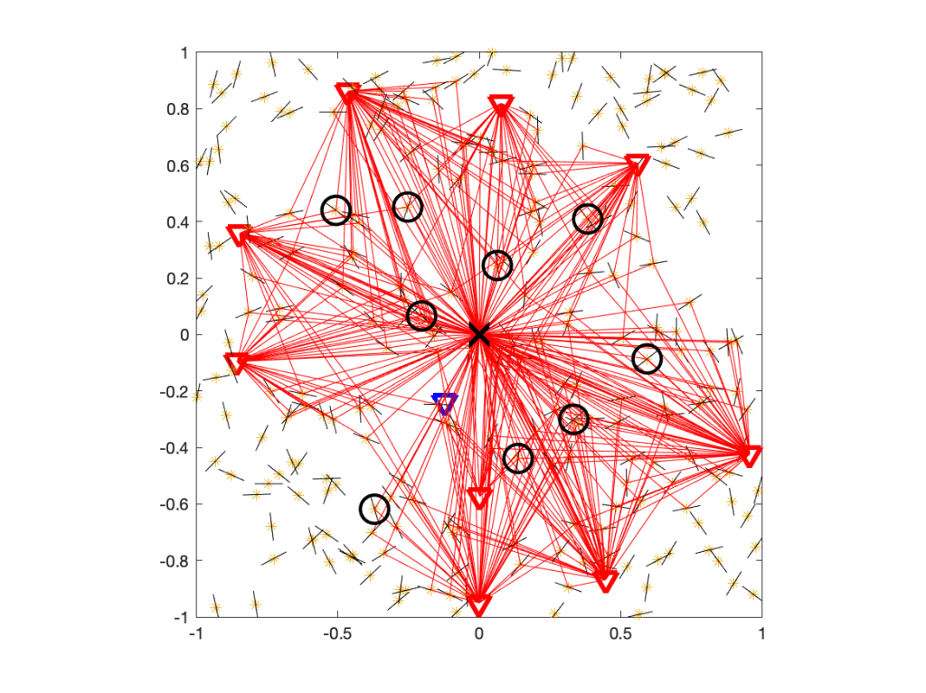
Now, let’s add one IRS per interfering BS. The resulting propagation environment is shown in Figure 2.
Figure 2. Propagation in a rich scattering environment with IRSs.
From the perspective of the user at the origin, the IRSs are unmatched, which means they act just like any of the other scattering and reflecting objects. So the difference to the IRS-free case is that there is a tiny fraction of additional scatterers, as highlighted in Figure 3.
Figure 3. Same as Figure 2, but with the IRSs encircled.
In this case, the IRSs add 4% to the scattering objects. If we did raytracing, they could make a small difference. In analytical work where the fading model is based on the assumption of a large number of scatterers, with the number of propagation paths tending to infinity, they make no difference at all. So we conclude that there is no extra interference Q due to the presence of passive IRSs and thus I=IBS. The signals reflected at unmatched IRSs are no different from signals reflected at any other object, and multi-path fading models already incorporate all such reflections.
Another argument that IRSs cannot cause extra interference is based on the fundamental principle of energy conservation. If Q did exist, its mean would be proportional to the density of IRSs deployed. This implies that there would be a density of IRSs beyond which the “interference” from the IRSs exceeds the total power transmitted by all BSs, which obviously is not physically possible.
Papers on wireless networks frequently present analytical approximations of distributions. The reference (exact) distributions are obtained either by simulation or by the numerical evaluation of a much more complicated analytical expression. The approximation and the reference distributions are then plotted, and a “highly accurate” or “extremely precise” match is usually declared. There are several issues with this approach. First, people disagree on what “highly accurate” means. If there is a yawning gap between the distributions, can (should) the match be declared “very precise”? Without any quantification of what “accurate” or “precise” means, it is hard to argue one way or another. Second, the visual impression can be distorted due to the use of a logarithmic (dB) scale and since, if the distribution has infinite support, only part of it can ever be plotted.
In this post I suggest an approach that addresses both these issues, assuming that at least one of the distributions in question is only available in numerical form (discrete data points). For the second one, we use the Möbius homeomorphic transform to map the infinite support to the [0,1] unit interval. Focusing on complementary cumulative distributions (ccdfs) and assuming the original distribution is supported on the positive real line, the mapped ccdf is obtained by
The MH transform and its advantages are discussed in this blog. For instance, it is very useful when applied to SIR distributions. In this case, the mapped ccdf is that of the signal fraction (ratio of desired signal power to total received power). For our purposes here, the [0,1] support is key as it allows not only a complete visualization but also lends itself as a natural distance metric that is itself normalized to [0,1]. Here is the definition of the MH distance:
Trivially it is bounded by 1, so the distance value directly and unambiguously measures the match between the ccdfs. Accordingly, we can use terms such as “mediocre match” or “good match” depending on this distance. The terminology should be consistent with the visual impression. For instance, if the MH ccdfs are indistinguishable, the match should be called “perfect”. Therefore, to address the first issue raised above, I propose the following intervals and terms.
term for match
range
bad
0.05 – 1
mediocre
0.02 – 0.05
acceptable
0.01 – 0.02
good
0.005 – 0.01
excellent
0.002 – 0.005
perfect
0 – 0.002
Table: Proposed terminology for match based on MH distance.
Another advantage of the MH distance is that it emphasizes the high-value regime (the ccdf near 0) over the low-value regime since it maps values near 0 without distortion while it compresses high values. In the case of SIR ccdfs whose value indicate reliabilities, high values mean high reliabilities, which is the relevant regime in practice. A simple Matlab implementation of the MH distance is available here. It accepts arbitrary values of the ccdf’s arguments and uses interpolation to achieve uniform sampling of the [0,1] interval.
As an example, here is an animation showing a standard exponential ccdf (MH mapped of course) in blue and another exponential ccdf with a parameter varying from 1.5 to 0.64. It is apparent that the terminology corresponds to the visual appraisal of the gap between the two ccdfs.
Figure: Illustration of MH distance and corresponding quality of the match between two exponential ccdfs.
Interference is the key performance-limiting factor in wireless networks. Due to the many unknown parts in a large network (transceiver locations, activity patterns, transmit power levels, fading), it is naturally modeled as a random variable, and the (only) theoretical tool to characterize its distribution is stochastic geometry. Accordingly, many stochastic geometry-based works focus on interference characterization, and some closed-form expressions have been obtained in the Poisson case.
If the path loss law exhibits a singularity at 0, such as the popular power-law r-α, the interference (power) may not have a finite mean if an interferer can be arbitrarily close to the receiver. For instance, if the interferers form an arbitrary stationary point process, the mean interference (at an arbitrary fixed location) is infinite irrespective of the path loss exponent. If α≤2, the interference is infinite in an almost sure sense.
This triggered questions about the validity of the singular path loss law and prompted some to argue that a bounded (capped) path loss law should be used, with α>2, to avoid such divergence of the mean. Of course the singular path loss law becomes unrealistic at some small distance, but is it really necessary to use a more complicated model that introduces a characteristic distance and destroys the elegant scale-free property of the singular (homogeneous) law?
The relevant question is to which extent the performance characterization of the wireless network suffers when using the singular model.
First, for practical densities, there are very few realizations where an interferer is within the near-field, and if it is, the link will be in outage irrespective of whether a bounded or singular model is used. This is because the performance is determined by the SIR, where the interference is in the denominator. Hence whether the interference is merely large or almost infinite makes no difference – for any reasonable threshold, the SIR will be too small for communication. Second, there is nothing wrong with a distribution with infinite mean. While standard undergraduate and graduate-level courses rarely discuss such distributions, they are quite natural to handle and pose no significant extra difficulty.
That said, there is a quantity that is very useful when it has a finite mean: the interference-to-(average)-signal ratio ISR, defined as
where x0 is the desired transmitter and the other points of Φ are interferers. The hx are the fading random variables (assumed to have mean 1), only present in the numerator (interference), since the signal power here is averaged over the fading. Taking the expectation of the ISR eliminates the fading, and we arrive at the mean ISR
which only depends on the network geometry. It follows that the SIR distribution is
where h is a generic fading random variable. If h is exponential (Rayleigh fading) and the MISR is finite,
Hence for small θ, the outage probability is proportional to θ with proportionality factor MISR. This simple fact becomes powerful in conjunction with the observation that in cellular networks, the SIR distributions (in dB) are essentially just shifted versions of the basic SIR distribution of the PPP (and of each other).
Figure 1: Examples for SIR distributions in cellular networks that are essentially shifted versions of each other.
In Fig. 1, the blue curve is the standard SIR ccdf of the Poisson cellular network, the red one is that of the triangular lattice, which has the same shape but shifted by about 3 dB, with very little dependence on the path loss exponent. The other two curves may be obtained using base station silencing and cooperation, for instance. Since the shift is almost constant, it can be determined by calculating the ratios of the MISRs of the different deployments or schemes. The asymptotic gain relative to the standard Poisson network (as θ→0) is
The MISR in this expression is the MISR for an alternative deployment or architecture. The MISR for the PPP is not hard to calculate. Extrapolating to the entire distribution by applying the gain everywhere, we have
This approach of shifting a baseline SIR distribution was proposed here and here. It is surprisingly accurate (as long as the diversity order of the transmission scheme is unchanged), and it can be extended to other types of fading. Details can be found here.
Hence there are good reasons to focus on the reversed SIR, i.e., the ISR.
These days, “connectivity” is a very popular term in wireless networking. Related to 5G, typical statements include
“5G will be the main driver of wireless connectivity.”
“5G is designed to provide more connectivity.”
“5G provides 1 million connected devices per square km.”
There is also talk about “massive connectivity”, “poor connectivity”, “intermittent connectivity”, “high-speed connectivity”, “dense connectivity”, “sparse connectivity”, “ubiquitous connectivity”, “heterogeneous connectivity”, “hard connectivity”, “soft connectivity” etc. My favorite, though, is “connection-less connectivity”.
While everyone has a (vague) sense of what “connectivity” or “being connected” could mean in a wireless context, it is quite surprising to see that there is hardly any definition to be found in the literature. Being vague and call on some common sense is probably acceptable in media articles targeted at a general audience. However, in the technical journals, including the IEEE transactions, I would expect that this term would be rigorously defined. However, in the vast majority of articles, this is not the case; there are papers on IEEE Xplore that mention “connectivity” several dozen times but the authors never explain what they mean by it.
For instance, if the so-called “internet-of-things” (IoT) is claimed to soon “connect” billions of devices, does that mean that each device can communicate to each other one at a certain rate with a certain latency and a certain reliability? If yes, what are the rate, latency, and reliability? Or does it mean that over the course of a long period (say a day), they can all send a message to the wired (internet) backbone? Again, what is the reliability of that happening? Or does it mean that all the devices are capable (in principle) to establish a TCP connection to some server? Similarly, with one million “connected” devices per square km in 5G, what are they “connected” to? Each other, or a base station? At what rate/delay/reliability? It is clear that at the physical and link/MAC layers, any notion of “connectivity” would need to include probabilities (reliabilities), rates (throughput), and delay (latency). But such specifications are sorely missing in most of the literature. Further, extra attributes such as “massive”, “poor”, “ubiquitous” lack definitions also, and in view of half-duplex, channel access and other resource constraints, all connectivity is “intermittent”, rather than permanent.
At the transport layer, the situation is not clear, either. Two devices can be declared “connected” if a TCP connection has been established (although this does not guarantee that they can actually exchange messages in a given time). Conversely, two devices can successfully communicate without begin “connected” in the sense of the transport layer if they use a connection-less protocol (UDP). So at this level, being “connected” is neither sufficient nor necessary for communication.
At a higher level of abstraction, if a network is represented as a graph, there is a clear (mathematical) definition of what it means for the network to be connected. However, a (standard) graph is a model for a wired network, not a wireless one, for it does not account for fading, beamforming, power control, channel access, interference, and half-duplex constraints. Fading and rates could be incorporated in a weighted graph, half-duplex communication in a directed graph (digraph), and channel access in a dynamic (time-dependent) graph. Interference, however, is much more complicated to incorporate in a graph model since the success of a transmission may depend on a large set of interfering transmitters, their channel states, and their transmit powers. Also, if in a dynamic graph model a link (directed edge) from A to B exists at a certain time k and a link exists from B to C at time j, a path (or connection) from A to C is only formed if k<j.
So what is a meaningful graphical model for a wireless network based on which connectivity can be rigorously defined? Let us assume that a transmission succeeds (i.e., a link exists) if the SINR at the receiver exceeds some value θ that is determined based on the coding and modulation schemes. This model incorporates all the physical layer aspects mentioned above and, if made dynamic, channel access and other time-varying aspects.
Letting Φ denote the set of node locations (vertices), the SINR-based (geometric) digraph at time k has the directed edge set
SINRxy is the SINR at y when it attempts to receive from x at time k. The SINR condition implies that for an edge to form, x is transmitting at time k while y is not (unless y is full-duplex-capable). Then
is a directed multigraph (multiple edges are allowed between two vertices) that captures the entire history of successful transmissions in the network up to time n. It may be called the space-time SINR multigraph at timen. Figure 1 shows movie of the evolution of a network with 36 nodes that are transmitting independently with probability 1/4 in each time slot (slotted ALOHA).
Fig. 1. Example of space-time SIR multigraphwith θ=3, path loss exponent 4, no noise, and Rayleigh fading. Filled circles indicate transmitters. Edges get thicker each time their link succeeds, and they turn red when bidirectionally is first achieved.
Figure 2 shows a larger network of the same type, with 400 nodes.
Fig. 2. Same as Figure 1 but with 400 nodes.
This graph reveals how many nodes can be reached from a given node within a certain time, or how many other nodes a node can receive a message from. Information in the network propagates along causal paths, i.e., paths where the first link is established before the second before the third, etc. To simplify the identification of such paths, the time index when an edge is established can be added as an edge weight.
Based on this graph, notions of percolation and connectivity can be rigorously defined. For connectivity, a natural definition is that the network is connected if causal paths exist between all pairs of nodes. A fairly general result can be proven without much difficulty: For arbitrary deterministic Φ∈ℝ2, ALOHA with transmit probability 0<p<1, a path loss exponent greater than 2, the graph G∞ is almost surely connected if the (independent) fading variables have infinite support, irrespective of the noise level.
When an analysis for a deterministic set of locations Φ seems hard, randomizing it to a point process may improve the tractability. A good starting point, as usual, is the PPP. For the PPP, one can hope to answer questions such as:
How long does it take on average for a message to propagate from node x to node y (first-passage percolation)? Here x and y are deterministically added to the node set.
Under which condition is the average time for a node to reach any other node infinite? (If this average time is infinite, the node could be declared isolated.)
Is the propagation speed, defined as the time it takes for information to travel from x to y normalized by their distance, zero or positive asymptotically as the distance grows to infinity?
Based on these results, parameters such as the transmit probability can be optimized.
Today we are listening in to a conversation between Achill and the Turtle.
Achill: I have been conducting research on the performance of wireless links for a while now, and I learnt that analyzing a fixed deterministic channel does not lead to insightful and general results. To capture a variety of channel conditions and obtain crisp analytical results, it is necessary to model the channel by a random process, even though physically there is no randomness in wireless propagation.
Turtle: Indeed. There are now families of channel models that are widely accepted, and it is mandated that researchers incorporate them in their published work. This way, the mean performance of a link (in terms of throughput, delay, and reliability) can be obtained by averaging over the likely channel conditions. In a more refined analysis, distributions of performance metrics are derived.
Achill: This is all good and nice, but lately I am trying to look beyond individual links and consider networks of wireless transceivers. In this case, the performance greatly depends on the distances between a receiver and its intended and interfering transmitters. But I don’t want to calculate results for a single fixed geometry – it is unwieldy and would apply only for those exact locations of transceivers. I know some people have randomized the propagation losses by assuming they are all iid across the network, but this would imply that all nodes have the same distance from all other nodes…
Turtle: …which would mean there can be at most d +1 nodes in a d -dimensional network.
Achill: Yes, and such a triangular or tetrahedral arrangement is very unlikely to occur. So unfortunately I have to resort to lengthy Monte Carlo simulations for my performance evaluations. If only there were analytical models, like the random processes I use for channel fading, that could characterize the network geometry…
Turtle: …plus a mathematical framework that would allow the derivation of analytical results, averaged over the likely network configurations. Or even reveal distributions of the quantities of interest. That would be extremely powerful and could lead to great new insights, much more so than simulations.
Achill: Very true. Too bad that this is just wishful thinking…
Turtle: Well, as a researcher it is important to keep an open mind.
Intuition may tell us that increasing the randomness in the system (e.g., by increasing the variance of some random variables relative to their mean) will decrease the correlation between some random quantities of interest. A prominent example is the interference or SIR in a wireless network measured at two locations or in two time slots.
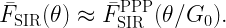
Let us consider a simple example to explore whether this intuition is correct. We consider the two random variables XY1 and XY2, where Y1 and Y2 are iid exponential with mean 1 and X is Bernoulli with mean p, independent of the Yk. In this case, Pearson’s correlation coefficient is
It is illustrated in Figure 1 below. The randomness in X, measured by the ratio of variance to mean, is 1-p . However, increasing the randomness monotonically increases the correlation. As p approaches 0, the correlation tends to its maximum of 1/2.
Figure 1: Correlation coefficient of XY1 and XY2 where X is Bernoulli(p) and Yk are iid exponential(1).
Next, let Y1 and Y2 be independent and Bernoulli with mean p and X gamma distributed with parameters m and 1/m, such that the mean of X is 1 and the variance 1/m. Again we focus on the correlation of the two products XY1 and XY2. In this case, the correlation coefficient is
shown in Figure 2 below for different values of m. Again, we observe that increasing the randomness in X (decreasing m) increases the correlation for all p <1. For p =1, the correlation is 1 since both random variables equal X.
Figure 2: Correlation coefficient of XY1 and XY2 where X is gamma(m,1/m) and Yk are iid Bernoulli(p).
So is the relationship between randomness and correlation completely counter-intuitive? Not quite, but our intuition is probably skewed towards the case of independent randomness, as opposed to common randomness. In the second example, the randomness in Y1 and Y2 decreases with p, and the correlation coefficient increases with p, as expected. Here Y1 and Y2 are independent. In contrast, X is the common randomness. If its variance increases, the opposite happens – the randomness decreases.
In the wireless setting, the common randomness is often the point process of transceiver locations, while the independent randomness usually comprises the fading coefficients and the channel access indicators. One of the earliest results on correlations in wireless networks is the following: For transmitters forming a PPP, with each one being active independently with probability p in each time slot (slotted ALOHA) and independent Nakagami-m fading, the correlation coefficient of the interference measured at the same location in two different time slots is (see Cor. 2 in this paper)
Here the fading coefficients have the same gamma distribution as in the second example above. As expected, increasing the randomness in the channel access (decreasing p) and in the fading (decreasing m) both reduce the correlation. Conversely, setting p =1 and letting m → ∞, the correlation coefficient is 1. However, the correlation is induced by the PPP as the common randomness – if the node placement was deterministic, the correlation would be 0. In other words, the interference in different times slots is conditionally independent given the PPP. This conditional independence is exploited in the analysis of important metrics such as the local delay and the SIR meta distribution.
One last remark. The expression (*) shows that the correlation coefficient is simply the product of the transmit probability p and the Nakagami fading parameter m mapped to the (0,1) interval using the Möbius homeomorphic transform described here, which is m /(m+1). This shows a nice symmetry in the impact of channel access and fading.
The previous blog highlighted that the Rayleigh fading channel model and the Poisson deployment model are very similar in terms of their tractability and in how realistic they are. It turns out that Rayleigh fading and the PPP are the neutral cases of channel fading and node deployment, respectively, in the following sense:
For Rayleigh fading, the power fading coefficients are exponential random variables with mean 1, which implies that the ratio of mean and variance is 1. If the ratio is smaller (bigger variance), the fading is stronger. If the variance goes to 0, there is less and less fading.
For the PPP, the ratio of the mean number of points in a finite region to its variance is 1. If the ratio is larger than 1, the point process is sub-Poissonian, and if the ratio is less than 1, it is super-Poissonian.
Prominent examples of super-Poissonian point processes are clustered processes, where clusters of points are placed at the points of a stationary parent process, and Cox processes, which are PPPs with random intensity measures. Sub-Poissonian processes include hard-core processes (e.g., lattices or Matérn hard-core processes) and soft-core processes (e.g., the Ginibre point process or other determinantal point processes, or hard-core processes with perturbations).
There is no convenient family of point process where the entire range from lattice to extreme clustering can be covered by tuning a single parameter. In contrast, for fading, Nakagami-m fading represents such a family of models. The power fading coefficients are gamma distributed with parameters m and 1/m, i.e., the probability density function is
with variance is 1/m. The case m =1 is the neutral case (Rayleigh fading), while 0<m <1 is strong (super-Rayleigh) fading, and m >1 is weak (sub-Rayleigh) fading. The following table summarizes the different classes of fading and point process models. NND stands for the nearest-neighbor distance of the typical point.
fading
point process
rigid
no fading (m → ∞)
lattice (deterministic NND)
weakly random
m >1 (sub-Rayleigh)
repulsive (sub-Poissonian)
neutral
m =1 (Rayleigh)
PPP
strongly random
m <1 (super-Rayleigh)
clustered (super-Poissonian)
extremely random
m → 0
clustered with mean NND → 0 (while maintaining density)
It is apparent that the Rayleigh-PPP model offers a good balance in the amount of randomness – not too weak and not too strong. Without specific knowledge on how large the variances in the channel coefficients and in the number of points in a region are, it is the natural default assumption. The other key reason why the combination of exponential (power) fading and the PPP is so symbiotic and popular is its tractability. It is enabled by two properties:
with Rayleigh fading in the desired link, the SIR distribution is given by the Laplace transform of the interference;
the Laplace transform, written as an expected product over the points process, has the form of a probability generating functional, which has a closed-form expression for the PPP.
The fading in the interfering channels can be arbitrary; what is essential for tractability is only the fading in the desired link.
When stochastic geometry applications in wireless networking were still in their infancy or youth, I was frequently asked “Do you believe in the PPP model?”. I usually answered with a counter-question:“Do you believe in the Rayleigh fading model?”. This “answer” was motivated by the high likelihood that the person asking was
familiar with the idea of modeling the effects of multi-path propagation using Rayleigh fading;
found it not only acceptable but quite natural to use a model with obvious shortcomings and limitations, for the sake of analytical tractability and design insight.
It usually turned out that the person quickly realized that the apparent shortcomings of the PPP model are quite comparable to those of the Rayleigh fading model, and that, conversely, they both share a high level of tractability.
Surely if one can accept that wireless signals propagate along infinitely many paths of comparable propagation loss with independent phases, resulting in a random received power with infinite support, one can accept a point process model with infinitely many points that are, loosely speaking, independently placed. If one can accept that at 0 dBm transmit power, there is a positive probability that the power received over a 1 km distance exceeds 90 dBm (1 MW), then surely one can accept that there is a positive probability that two points are separated by only 1 cm.
So why is it that Rayleigh fading was (and perhaps still is) more acceptable than the PPP? Is it just that Rayleigh fading has been used for wireless channel modeling for much longer than the PPP? Perhaps. But maybe part of the answer lies in what prompts us to use stochastic models in the first place.
Fundamentally there is no randomness in wireless propagation. If we know the characteristics of the antennas and the locations and properties of all objects, we can calculate the channel parameters exactly (say by raytracing) – and if there is no mobility, the channel stays fixed forever. So why introduce randomness where there is none? There are two reasons:
Raytracing is computationally expensive
The results obtained only apply to one very specific scenario. If a piece of furniture is moved a bit, we need to start from scratch.
Often the goal is to design a communication architecture, but such design cannot be based on the layout of a specific room. So we need a model that captures the characteristics of the channels in many rooms in many buildings, but obtaining such a large data set would be very expensive, and it would be hard to derive any useful insight from it. In contrast, a random model offers simplicity and superior tractability.
Similarly, in a network of transceivers, we could in principle assume that all their locations (and mobility vectors) are known, plus their transmit powers. Then, together with the (deterministic) channels, the interference power would be a deterministic quantity. This is very impractical and, as above, we do not want to decide on the standards for 7G cellular networks based on a given set of base station and user (and pet and vacuum robot and toaster and cactus) locations. Instead we aim for the robust design that a random spatial model (i.e., a point process) offers.
Another aspect here is that the channel fading process is often perceived (and modeled) as a random process in time. Although any temporal change in the channel is but a consequence of a spatial change, it is convenient to disregard the purely spatial nature of fading and assume it to be temporal. Then we can apply the standard machinery for temporal random processes in the performance analysis of a link. This includes, in particular, ergodicity, which conveniently allows us to argue that over some time period the performance will be close to that predicted by the ensemble average. The temporal form of ergodicity appears to be much more ingrained in our thinking than its spatial counterpart, which is at least as powerful: in an ergodic point process, the average performance of all links in each realization corresponds to that of the typical link (in the sense of the ensemble average). In the earlier days of stochastic geometry applications to wireless networks this key equivalence was not well understood – in particular by reviewers. Frequently they pointed out that the PPP model (or any point process model for that matter) is only relevant for networks with very high mobility, believing that only high mobility would justifiy the ensemble averaging. Luckily this is much less of an issue nowadays.
So far we have discussed Rayleigh fading and the PPP separately. The true strength of these simple models becomes apparent when they are combined into a wireless network model. In fact, most of the elegant closed-form stochastic geometry results for wireless networks are based on (or restricted to) this combination. There are several reason for this symbiotic relationship between the two models, which we will explore in a later post.
Let us consider a hypothetical situation where the authors of a paper promise the following:
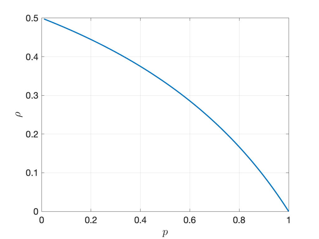
“In the next figure, we compare our Quantum Ultra-Enhanced Superior-Throughput Intelligent Objectively-Novel Adaptive Beamformed Low-Latency Emission (QUESTIONABLE) scheme with the Arbitrarily-Massive Antenna Zero-Innovation Neural Grandiloquence (AMAZING) scheme, which is the best previously known scheme. As the figure shows, the QUESTIONABLE scheme outperforms the AMAZING scheme by 6122% at a threshold of 2 dB.”
They refer to this figure:
Fig. 1: Fair comparison of our QUESTIONABLE scheme with the AMAZING scheme reported elsewhere. As is clearly apparent, the reliability gain at 2 dB is very high, unquestionably.
A gain of more than 6,000% sounds, well, amazing. But it also questionable: Is it good practice to state this figure of 6122%? Is it good marketing? Is it acceptable? Should it be discouraged? Is it even unethical? If claiming 6122% at 2 dB is acceptable, how about a 25119% gain at 10 dB? Here the absolute reliability of AMAZING is 6.3e-9, and that of QUESTIONABLE is 1.60e-6. Not a practical regime, but a more than 25000% gain nonetheless.
Conversely, at -1.5 dB, the improvement is from 0.996 (which is AMAZING) to 0.9999999 (which is QUESTIONABLE). This is a modest 0.4% improvement both in absolute and relative terms. However, focusing on outage instead of reliability, the factor between the two outage probabilities is 62763, or 6,276,267%. So the 0.4% gap becomes a 6M% gap (that’s mega-percent, admittedly an usual combination of a metric prefix with a unit).
Independently of such amazing and questionable transmission schemes, is an improvement from 10% to 13% a 3% improvement or a 30% improvement? Frequently we see such a gain reported as a 30% improvement. Is it fair to use the ratio to measure improvement, or should it be the gap (difference)? Equivalently, should the percentage improvement be measure in percent of the underlying quantity (in which case it is 3%) or in percent of the percentages (in which case it is 30%)? The problem is that terms like “gain”, “increase”, “improvement”, “boost”, “raise” are imprecise as they may refer to differences or ratios.
How about an improvement from 10 dB to 13 dB? Here, most people would agree that the gain is 3 dB. The reason why there is no ambiguity here is that 3 dB is both the difference 13 dB-10 dB and also the ratio of the underlying quantities expressed in dB, 20/10. Thanks to the logarithm in the dB scale, both lead to the same result. With percentages, this is not the case.
The ambiguity also manifests itself when we compare percentages with physical units such as meters or seconds. The difference between 10 m and 13 m is 3 m, and 13 m is 30% longer than 10 m. Percentage gains always measure ratios in this case. But if “meter” is replaced by “percent”, the situation becomes murky. By analogy then the difference between 10% and 13% is 3%, so 13% is 3% more than 10%, in the same way that 13 m is 3 m more than 10 m. But at the same time, 13% is 30% more than 10%, in the same way that 13 m is 30% more than 10 m.
So how do we resolve this? Here are some suggestions:
Always state whether we refer to ratios or difference. For instance, instead of saying “The increase is 30%” say the “increase is a factor of 1.3 or 30%”.
Avoid ambiguity by using fractions instead of percentages. For instance, the difference between 0.1 and 0.13 is 0.03, and the ratio is 1.3.
Avoid aggressive marketing when quantities are in very impractical regimes. For instance, in the example above, advertising huge gains at reliabilities below 1e-5 is not good practice. Conversely, in regimes of interest, such as the high-reliablity regime, it is perfectly acceptable to report a gain of 100 in the outage performance if the outage probability is reduced from 0.01 to 0.0001. (However, talking about 10,000% is not recommended.)
Consider using horizontal distances (gaps) instead of vertical ones. Especially with steep (almost step-like) curves like the one in Fig. 1, the vertical gap strongly depends on where it is measured along the x axis. Conversely, the horizontal gap may be fairly constant. In the case of Fig. 1, the horizontal gap is, in fact, constant. It is exactly 3 dB at all reliabilities. A quasi-constant gap is often observed in SIR distributions (cdfs) of cellular networks when different transmission schemes are compared. The theory behind is explained in this letter (here on IEEE Xplore) and in this paper (here on IEEE Xplore). In this case, the gains are either factors (in linear scale) or gaps (in the dB) scale. This method of reporting gains is the one adopted by the coding theory community – coding gains are reported in dB (horizontally), not as gains in the bit error performance (vertically).