Month: October 2020

Physical quantities and scale-free results

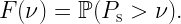
Sometimes we read in a paper “the link distance is d meters”. Then, a bit later, “In Fig. 3, we set d=10 m”. Putting the two together, this means that “the link distance is 10 m meters”, which of course isn’t what the authors mean. It is not hard to infer that they mean the distance is 10 m, rather than 10 m2. But then why not just say “the link distance is d” from the outset?

Physical quantities are a combination of a numerical value and a unit. If symbols refer to physical quantities, equations are valid irrespective of any metric prefixes used. For example, if the density of a two-dimensional stationary point process is λ, then the mean number of points in a disk of radius r is always λπr2. We can express the radius as r=100 m or as r=0.1 km or r=10000 cm, and the density could be λ=0.1 km-2 or λ=10-5 m-2. In contrast, if a symbol only refers to the numerical value of the physical quantity, the underlying unit (and prefix) needs to be specified separately, and the reader needs to keep it in mind. For example, writing λ=10 and r=2 does not tell us anything about the mean number of points in the disk without the units. If the density is said to be λ m-2 and the radius is said to be r km, then we can infer that there are 40,000,000π points on average in the disk, but if the radius is r m, then there are a mere 40π points.

Separating the numerical values from the units also comes at a loss in flexibility. The advantage of the SI unit system with its metric prefixes is that we can express small and large values conveniently, such as d=5 nm or f=3 THz. Hard-wiring the units by saying “the frequency is f Hz” means that we have to write f=3,000,000,000,000 instead – and expect the reader to memorize that f is expressed in Hz. One may argue that in this case it would be natural to declare that “the frequency is f THz”, but what if much lower frequencies also appear in the paper? A Doppler shift of 10 kHz would become a Doppler shift of f=0.00000001.

This leads to the next problem, which is that some quantities are naturally expressed at a different scale (i.e., with a different metric prefix) than others. Transistor gate lengths are usually expressed in nm, while lengths of fiber optic cables may be expressed in km, and many other lengths and distances fall in between, say wavelengths, antenna spacing, base station height, intervehicular distances etc. Can we expect the readers to keep track of all the base units when we write “the gate length is u nm”, “the wavelength is v cm”, and “the base station height is h m”?

In conclusion, there is really no advantage to this kind of separation. In other words, having mathematical symbols refer to physical quantities rather than just numerical values (while the unit is defined elsewhere) is always preferable.

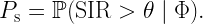
Now, there are cases, where it makes perfect sense to omit a unit when defining a quantity, say a density or a distance. For example, the normalized notation r=10 or λ=3 is acceptable (usually even preferred) when the normalization reference can be arbitrary. For example, the classical result for the SIR distribution in Poisson bipolar networks (link distance r, path loss exponent 2/δ, Rayleigh fading) is

\displaystyle F(\theta)=\exp(-c(\delta)\lambda r^2\theta^\delta),

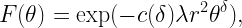
irrespective of whether r is normalized by 1 m or 1 km – as long as λ is normalized accordingly, i.e., by 1 m-2 or 1 km-2). Such scale-free results are particularly elegant, because they show that shrinking or expanding the network does not change the result. They may also indicate that one parameter can be fixed without loss of generality. In this example, what matters is the product λ r2, so setting λ=1 or r=1 is sensible to reduce the number of parameters.

One more thing. The conflation of a unit and a noun describing a physical quantity or device has become somewhat popular, unfortunately. It violates rule of proper English composition and also the guidelines for scientific writing as put forth by, for example, IEEE. Let us hope they do not spread further, otherwise we need to get used to THzFrequencies, cmDistances, MsLifetimes, pJConsumptions, km-2Densities etc. Further, improper capitalization can drastically change the quantities. The gap between a mmLength and a MmLength is 9 orders of magnitude, that between a pASource and a PASource is 27 orders of magnitude, and that between ymGaps and YmGaps is 48 orders of magnitude!

Single-point simulation?

When applying simalysis as illustrated in the previous post, the question arises where to put the boundary between the part of the point process that is simulated and the part that is analyzed. Specifically, we may wonder whether we can reduce the simulated part to only a single point (on average), i.e., to choose the number of simulated points to be Poisson with mean 1 in each realization.
Let’s find out, using the same Poisson bipolar model as in the previous post (Rayleigh fading, transmitter density 1, link distance 1/4).

Fig. 1. Simalysis of SIR ccdf for Poisson bipolar network averaged over 500 realizations with 1 point on average. The dashed curves show the exact results.

Fig. 1 shows the simulated (or, more precisely, simalyzed) result where the 500 realizations only contain one single point on average. This means that about 500/e ≈ 184 realizations have no point at all. We observe good accuracy, especially at small path loss exponents α. Also, the simulated curves are lower bounds to the exact ones. This is due to Jensen’s inequality:

\displaystyle \mathbb{E}\exp(-sI_c) \geq \exp(-s\mathbb{E}(I_c)),\quad s>0.

The term on the left side is the exact factor in the SIR ccdf due to the interference Ic from points outside distance c. It is larger than the right side, which is the factor used in the simalysis (see the Matlab code). This property holds for all stationary point processes.

But why stop there? One would think that using, say, only 1/4 point on average would be (essentially) pointless. But let’s try, just to be sure.

Fig. 2. Same plot as in Fig. 1 but the curves are simalyzed with only 1/4 point per realization on average.

Remarkably, even with only 1/4 point per realization on average, the curves for α<2.5 are quite accurate, and the one for α=2.1 is an excellent lower bound! It is certainly much more accurate than a classical simulation with 500,000 points per realization (see the previous post). Such a good match is quite surprising, especially considering that 1/4 point on average means that about 78% of the realizations have 0 points, which means that in about 390 out of the 500 realizations, the simulated factor in the SIR ccdf simply yields 1. Also, in the entire simalysis, only about 125 points are ever produced. It takes no more than about 1/2 s on a standard computer.
We conclude that accurate simulation (simalysis, actually) can be almost point-less.

Simalysis: Symbiosis of simulation and analysis

Simulations can be quite time-consuming. Are there any techniques that can help make them more efficient and/or accurate? Let us focus on a concrete problem. Say we would like to plot the SIR distribution in a Poisson bipolar network for different path loss exponents α, including some values close to 2. Since we would like to compare the result with the exact one, we focus on the Rayleigh fading case where the analytical expression is known and simple. The goal is to get accurate curves for α=3, 2.5, 2.25, and 2.1, and we would like to wait no longer than 1 s for the results on a standard desktop or laptop computer.
Let us first discuss why this is a non-trivial problem. It involves averaging w.r.t. the fading and the point process, and we need to make sure that the number of interferers is large enough for good accuracy. But what is “large enough”? A quick calculation using Campbell’s theorem (for sums) reveals that if we want to capture 99% of the mean interference power (outside radius 1 to avoid complications due to a potential singularity in the path loss law), we find that for α=3, the simulation region needs to be 100 times larger than for α=4. This seems manageable, but for α=2.5, 2.25, 2.1, it is 106, 1014, 1038 times larger, respectively!
Clearly the straightforward approach of producing many realizations of the PPP in a large region does not work in the regime of small α. So how can we achieve our goal above – high accuracy and high efficiency?

The solution is to use an analysis-enhanced simulation technique, which I call simalysis. While we often tend to think as analysis vs. simulation as a dichotomy, in this approach they are used symbiotically. The idea is to exploit analytical results whenever possible to make simulations faster and more accurate. Let me illustrate how simalysis works when applied to the problem above.

For small α, it is impossible to “capture” most of the interference solely by simulation. In fact, most of it stems from the infinitely many distance nodes, each one contributing little, with independent fading. We can thus assume that the variance of the interference of the nodes further than a certain distance (relatively large compared with the mean nearest-neighbor distance) is relatively small. Accordingly, replacing it by its mean is a sensible simplification. Here is where the analysis comes in. For any stationary point process of density λ, the mean interference from the nodes outside distance c is

\displaystyle I(c)=2\pi\lambda\int_c^\infty r^{1-\alpha}{\rm d} r=\frac{2\pi\lambda}{\alpha-2} c^{2-\alpha}.

This interference term can then be added to the simulated interference, which stems from points within distance c. Simulating as few as 50 points is enough for very high accuracy. The result is shown in the figure below, using the MH scale so that the entire distribution is revealed (see this post for details on the MH scale). For α near 2, the curves are indistinguishable!

Fig. 1. SIR distribution for Poisson bipolar network in MH scale. Density 1, link distance 1/4.
The solid lines are obtained by simalysis, the dashed lines show the exact analytical results.

This simulation averages over 500 realizations of the PPP and runs in less than 1 s on a laptop. The Matlab code is available here. It uses a second simalytic technique, namely the analytical averaging over the fading. Irrespective of the type of point process we want to simulate, as long as the fading is Rayleigh, we can perform the averaging over the fading analytically.

For comparison, the figure below shows the simulation results if 500,000 points (interferers) are simulated, without adding the analytical mean interference term, i.e., using classical simulation. Despite taking 600 times longer, the distributions for α<2.5 are not acceptable.

Fig. 2. Classically simulated SIR distribution (solid lines) in Poisson bipolar network, compared with the exact analytical ones (dashed). Same parameters as in Fig. 1.

Double-proving by simulation?

Let us consider a hypothetical scenario that illustrates an issue I frequently observe.


Author: Here is an important result for a canonical Poisson bipolar network:
Theorem: The complementary cumulative distribution of the SIR in a Poisson bipolar network with Rayleigh fading, transmitter density λ, link distance r, and path loss exponent 2/δ is

\displaystyle \bar F(\theta)=\exp(-\lambda\pi r^2 \theta^\delta\Gamma(1-\delta)\Gamma(1+\delta)).

Proof: [Gives proof based on the probability generating functional.]

Reviewer: This is a nice result, but it is not validated by simulation. Please provide simulation results.


We have a proven exact analytical (PEA) result. So why would we need a simulation for “validation”? Where does the lack of trust in proofs come from? I am puzzled by these requests by reviewers. Similar issues arise when authors themselves feel the need to add simulations to the visualization of PEA results.
Perhaps some reviewers are not familiar with the analytical tools used or they think it is easier to have a quick look at a simulated curve rather than checking a proof. Perhaps some authors are not entirely sure their proofs are valid, or they think reviewers are more likely to trust the proofs if simulations are also shown.
The key issue is that such requests by reviewers or simulations by authors take simulation results as the “ground truth”, while portraying PEA results as weaker statements that need validation. This of course is not the case. A PEA result expresses a mathematical fact and thus does not need any further “corroboration”.
Now, if the simulation results are accurate, the analytical and simulated curves lie exactly on top of each other, and the accompanying text states the obvious: “Look, the curves match!”. But what if there isn’t an exact match between the analytical and the simulated curve? Which means that the simulation is not accurate. Certainly that does not qualify as “validation”. The worst conclusion would be to distrust the PEA result and take the simulation as the true result.
By its nature, a simulation is always restricted to a small cross-section of the parameter space. Even the simple result above has four parameters, which would make it hard to comprehensively simulate the network. Related, I am inviting the reader to simulate the result for a path loss exponent α=2.1 or δ=0.95. Almost surely the simulated curve will look quite different from the analytical one.
In conclusion, there is absolutely no need for “two-step verification” of PEA results. On the contrary.

Fraction of reliable links

The fraction of reliable links is an important metric, in particular for applications with (ultra-)high reliability requirements. In the literature, we see that it is sometimes equated with the transmission success probability of the typical link, given by

\displaystyle p_{\text{s}}=\mathbb{P}(\text{SIR}>\theta).

This is the SIR distribution (in terms of the complementary cdf) at the typical link. In this post I would like to discuss whether it is accurate to call ps the fraction of reliable links.

Say someone claims “The fraction of reliable links in this network is ps=0.8″, and I ask “But how reliable are these links?”. The answer might be “They are (at least) 80% reliable of course, because ps=0.8.” Ok, so let us assume that the fraction links with reliability at least 0.8 is 0.8. Following the same logic, the fraction of links with reliability at least 0.7 would be 0.7. But clearly that fraction cannot be smaller than the fraction of links with reliability at least 0.8. There is an obvious contradiction. So how can we quantify the fraction of reliable links in a rigorous way?

First we note that in the expression for ps, there is no notion of reliability but ps itself. This leads to the wrong interpretation above that a fraction ps  of links has reliability at least ps. Instead, we want so specify a reliability threshold so that we can say, e.g., “the fraction of links that are at least 90% reliable is 0.8”. Naturally it then follows that the fraction of links that are at least 80% reliable must be larger than (or equal to) 0.8. So a meaningful expression for the fraction of reliable links must involve a reliability threshold parameter that can be tuned from 0 to 1, irrespective of how reliable the typical link happens to be.

Second, ps gives no indication about the reliability of individual links. In particular, it does not specify what fraction of links achieve a certain reliability, say 0.8. It could be all of them, or 2/3, or 1/2, or 1/5. ps=0.8 means that the probability of transmission success over the typical link is 0.8. Equivalently, in an ergodic setting, in every time slot, a fraction 0.8 of all links happens to succeed, in every realization of the point process. But some links will be highly reliable, while others will be less reliable.

Before getting to the definition of the fraction of reliable links, let us focus on Poisson bipolar networks for illustration, with the following concrete parameters: link distance 1/4, path loss exponent 4, target SIR threshold θ=1, and the fading is iid Rayleigh. The link density is λ, and we use slotted ALOHA with transmit probability is p. In this case, the well-known expression for ps is

\displaystyle p_{\text{s}}=\exp(-c\lambda p),

where c=0.3084 is a function of link distance, path loss exponent, and SIR threshold. We note that if we keep λp constant, ps remains unchanged. Now, instead of just considering the typical link, let us consider all the links in a realization of the network, i.e., for a given set of locations of all transceivers. The video below shows the histogram of the individual link reliabilities for constant λp=1 while varying the transmit probability p from 1.00 to 0.01 in steps of 0.01. The red line indicates ps, which is the average of all link reliabilities and remains constant at 0.735. Clearly, the distribution of link reliabilities changes significantly even with constant ps – as surmised above, ps does not reveal how disparate the reliabilities are. The symbol σ refers to the standard deviation of the reliability distribution, starting at 0.3 at p=1 and decreasing to less than 1/10 of that for p=1/100.

Histogram of link reliabilities in bipolar network.

Equipped with the blue histogram (or pdf), we can easily determine what fraction of links achieves a certain reliability, say 0.6, 0.7, or 0.8. These are shown in the plot below. It is apparent that for small p, due to the concentration of the link reliabilities as p→0, the fraction of reliable links tends to 0 or 1, depending on whether the reliability threshold is above or below the average ps .

Fraction of links achieving reliability at least 0.6, 0.7, 0.8.

So how do we characterize the link reliability distribution theoretically? We start with the conditional SIR ccdf at the typical link, given the point process:

\displaystyle P_{\text{s}}=\mathbb{P}(\text{SIR}>\theta\mid\Phi).

Then ps=E(Ps), with the expectation taken over the point process. Hence ps is the mean of the conditional success probability, and if we consider its distribution, we arrive at the link reliability distribution, shown in blue in the video above. Mathematically,

\displaystyle F(\nu)=\mathbb{P}(P_{\text{s}}>\nu).

where ν is the target reliability. This distribution is a meta distribution, since it is the distribution of a conditional distribution. In ergodic settings, it specifies the fraction of links that achieve an SIR of θ with reliability at least ν, which is exactly what we set out to quantify.
In conclusion: The fraction of reliable links is not given by the standard (mean) success probability; it is given by the meta distribution of the SIR.