Let us consider a hypothetical situation where the authors of a paper promise the following:
“In the next figure, we compare our Quantum Ultra-Enhanced Superior-Throughput Intelligent Objectively-Novel Adaptive Beamformed Low-Latency Emission (QUESTIONABLE) scheme with the Arbitrarily-Massive Antenna Zero-Innovation Neural Grandiloquence (AMAZING) scheme, which is the best previously known scheme. As the figure shows, the QUESTIONABLE scheme outperforms the AMAZING scheme by 6122% at a threshold of 2 dB.”
They refer to this figure:
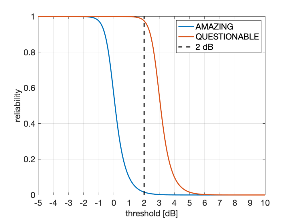
A gain of more than 6,000% sounds, well, amazing. But it also questionable: Is it good practice to state this figure of 6122%? Is it good marketing? Is it acceptable? Should it be discouraged? Is it even unethical?
If claiming 6122% at 2 dB is acceptable, how about a 25119% gain at 10 dB? Here the absolute reliability of AMAZING is 6.3e-9, and that of QUESTIONABLE is 1.60e-6. Not a practical regime, but a more than 25000% gain nonetheless.
Conversely, at -1.5 dB, the improvement is from 0.996 (which is AMAZING) to 0.9999999 (which is QUESTIONABLE). This is a modest 0.4% improvement both in absolute and relative terms. However, focusing on outage instead of reliability, the factor between the two outage probabilities is 62763, or 6,276,267%. So the 0.4% gap becomes a 6M% gap (that’s mega-percent, admittedly an usual combination of a metric prefix with a unit).
Independently of such amazing and questionable transmission schemes, is an improvement from 10% to 13% a 3% improvement or a 30% improvement? Frequently we see such a gain reported as a 30% improvement. Is it fair to use the ratio to measure improvement, or should it be the gap (difference)? Equivalently, should the percentage improvement be measure in percent of the underlying quantity (in which case it is 3%) or in percent of the percentages (in which case it is 30%)? The problem is that terms like “gain”, “increase”, “improvement”, “boost”, “raise” are imprecise as they may refer to differences or ratios.
How about an improvement from 10 dB to 13 dB? Here, most people would agree that the gain is 3 dB. The reason why there is no ambiguity here is that 3 dB is both the difference 13 dB-10 dB and also the ratio of the underlying quantities expressed in dB, 20/10. Thanks to the logarithm in the dB scale, both lead to the same result. With percentages, this is not the case.
The ambiguity also manifests itself when we compare percentages with physical units such as meters or seconds. The difference between 10 m and 13 m is 3 m, and 13 m is 30% longer than 10 m. Percentage gains always measure ratios in this case. But if “meter” is replaced by “percent”, the situation becomes murky. By analogy then the difference between 10% and 13% is 3%, so 13% is 3% more than 10%, in the same way that 13 m is 3 m more than 10 m. But at the same time, 13% is 30% more than 10%, in the same way that 13 m is 30% more than 10 m.
So how do we resolve this? Here are some suggestions:
- Always state whether we refer to ratios or difference. For instance, instead of saying “The increase is 30%” say the “increase is a factor of 1.3 or 30%”.
- Avoid ambiguity by using fractions instead of percentages. For instance, the difference between 0.1 and 0.13 is 0.03, and the ratio is 1.3.
- Avoid aggressive marketing when quantities are in very impractical regimes. For instance, in the example above, advertising huge gains at reliabilities below 1e-5 is not good practice. Conversely, in regimes of interest, such as the high-reliablity regime, it is perfectly acceptable to report a gain of 100 in the outage performance if the outage probability is reduced from 0.01 to 0.0001. (However, talking about 10,000% is not recommended.)
- Consider using horizontal distances (gaps) instead of vertical ones. Especially with steep (almost step-like) curves like the one in Fig. 1, the vertical gap strongly depends on where it is measured along the x axis. Conversely, the horizontal gap may be fairly constant. In the case of Fig. 1, the horizontal gap is, in fact, constant. It is exactly 3 dB at all reliabilities. A quasi-constant gap is often observed in SIR distributions (cdfs) of cellular networks when different transmission schemes are compared. The theory behind is explained in this letter (here on IEEE Xplore) and in this paper (here on IEEE Xplore). In this case, the gains are either factors (in linear scale) or gaps (in the dB) scale. This method of reporting gains is the one adopted by the coding theory community – coding gains are reported in dB (horizontally), not as gains in the bit error performance (vertically).


