Coverage is a key metric in wireless networks but usually only analyzed in terms of the covered area fraction, which is a scalar in [0,1]. Here we discuss a method to analytically bound the coverage manifold 𝒞, formed by the locations y on the plane where users are covered in the sense that the probability that the signal-to-interference ratio (SIR) exceeds a threshold θ is at least u (as argued here, this is a sensible definition of coverage):

SIR(y) is the SIR measured at y for a given set of transmitters 𝒳={x1,x2,…} where the nearest transmitter provides the desired signal while all others interfere. It is given by

where ri is the distance to the i-th nearest transmitter to y and the coefficients Hi=h1/hi are identically distributed with cdf FH. The coverage cell when x is the desired transmitter is denoted as Cx, so 𝒞 is the union of all Cx, x∈𝒳. To find an outer bound to the Cx, we are defining a cell consisting of locations at which there is no single interferer that causes them to be uncovered. In that cell, which we call the Q cell Qx, the ratio of the distance to the nearest interferer to the distance of the serving transmitter has to be larger than a suitably chosen parameter ρ, i.e.,

The numerator is the distance to the nearest interferer to y. The shape of the Q cell is governed by a first key insight (which is 2200 years old):
Key Insight 1: Given two points, the locations where the ratio of the distances to the two points equals ρ form a circle whose center and radius depend on the two points and ρ.
For ρ>1, which is the regime of practical interest, the Q cell is the intersection of a number of disks, one for each interferer. For the more distant interferers, the radii of the disks get large that they are not restricting the Q cell. As a result, a Q cell consists of either just one disk, the intersection of two disks, or a polygon plus a small number of disk segments. In the example in Figure 1, only the four disks with black boundaries are relevant. Their centers and radii are given by the locations of the four strongest interferers, marked by red crosses.
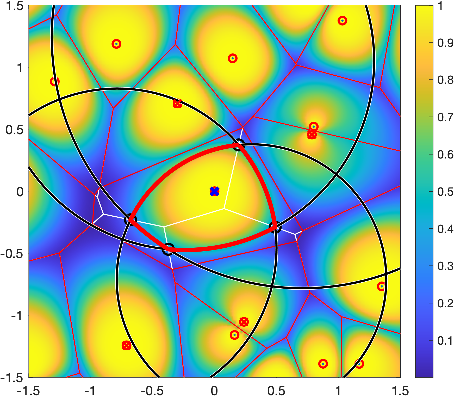
√2 of the transmitter at the origin is shown in red. It is formed by four black circles. The square is colored according to ℙ(SIR>1) for Rayleigh fading.The remaining question is the connection between the distance ratio parameter ρ and the quality-of-service (QoS) parameters θ and u. It is given as

where

is called the stringency and FH-1 is the quantile function of H (inverse of FH). For Rayleigh fading,

Figure 1 shows a Q cell for θ=1 and u=0.8, hence (with Rayleigh fading) ρα=4, and ρ=√2 for α=4. It is apparent from the coloring that outside the Q cell, the reliability is strictly smaller than 0.8.
The second key important insight is that the Q cells only depend on ρ, so there is no need to explore the three-dimensional parameter space (θ, u, α) in analysis or visualization.
Key Insight 2: The Q cells are the same for all combinations of θ, u, and α that have the same ρ.
Accordingly, Figure 2, which shows Q cells for four values of ρ, encapsulates many combinations of θ, u, and α.

If ρ=1, the Q cells equal the Voronoi cells, and for ρ<1, they span the entire plane minus an exclusion disk for each interferer. This case is less relevant in practice since it corresponds to very lax QoS requirements (small rate and/or low reliability, resulting in a stringency less than 1).
Since Cx ⊂ Qx for each transmitter x, the union of Q cells is an outer bound to the coverage manifold.
If 𝒳 is a stationary and ergodic point process, the area fraction of the coverage manifold corresponds to the meta distribution (MD) of the SIR, and the area fraction covered by the Q cells is an upper bound to the MD. For the Poisson point process (PPP), the Q cells cover an area fraction of ρ-2, and for any stationary point process of transmitters, they cover less than 4/(1+ρ)2. This implies that for any stationary point process of users, at least a fraction 1-4/(1+ρ)2 of users is uncovered. This shows how quickly users become uncovered if the stringency increases.
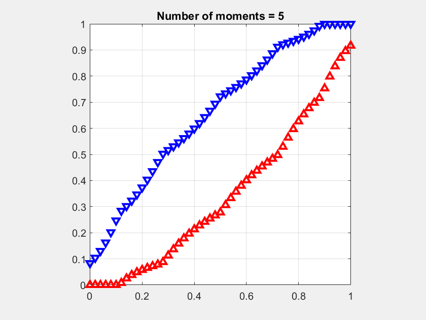
Details on the calculation of the stringency for different fading models and the proofs of the properties of the Q cells can be found here. This paper also shows a method to refine the Q cells by “cutting corners”, which is possible since the corners of the Q cells have two interferers are equal distance but only one is taken into account. Further, if the MD is known, the refined Q cells can be shrunk so that their covered area fraction matches the MD; this way, accurate estimates of the coverage manifolds are obtained. Figure 3 shows an example of refined and scaled refined Q cells where the transmitters form a perturbed (noisy) square lattice, in comparison with the exact coverage cells Cx.

Due to the simple geometric construction, bounding property, and general applicability to all fading and path loss models, Q cell analysis is useful for rapid yet accurate explorations of base station placements, resource allocation schemes, and advanced transmission techniques including base station cooperation (CoMP) and non-orthogonal multiple access (NOMA).