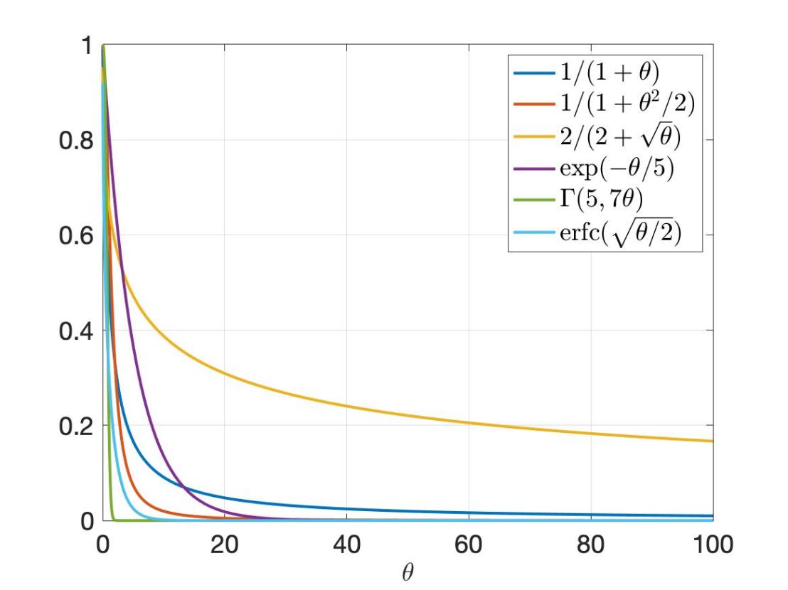
When visualizing distributions with infinite support, we face the challenge that they can only be shown partially. Usually we try to judiciously choose the interval of our plot so that the interesting part is revealed, and it is understood that outside that interval the function is essentially zero (for a density) or essentially zero or one (for a cumulative distribution). However, there are two disadvantages to that approach: First, if two distributions are not shown on the same interval, it is hard to compare them. Second, interesting asymptotic behavior in the tails are masked. In many cases, using a linear scale suffers from a third shortcoming: Interesting features may occur on a significantly different scale. Which would require choosing a large interval, but that, in turn, may mask the behavior in some parts.
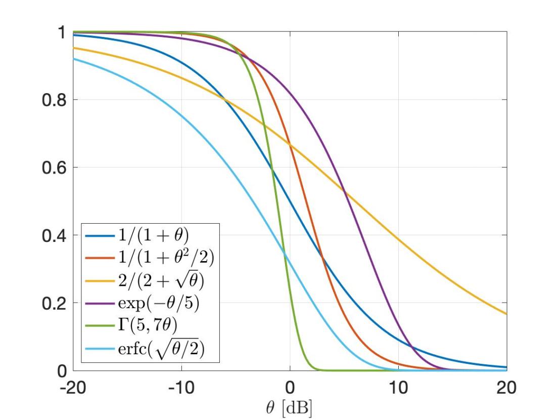
When plotting distribution of signal-to-interference ratios (SIRs), the standard approach is to use a dB scale. The complementary cumulative distribution (ccdf) is usually interpreted as the success probability of a transmission (in an interference-limited setting). While the dB scale allows for visualization the cccdf over a larger range, it has its own shortcomings: First, it turns the one-sided infinite support [0,∞) into the two-sided infinite support (-∞,∞), which can make selecting a suitable interval harder. Second, it distorts the ccdf, which prevents the viewer from obtaining insight into asymptotic behaviors.
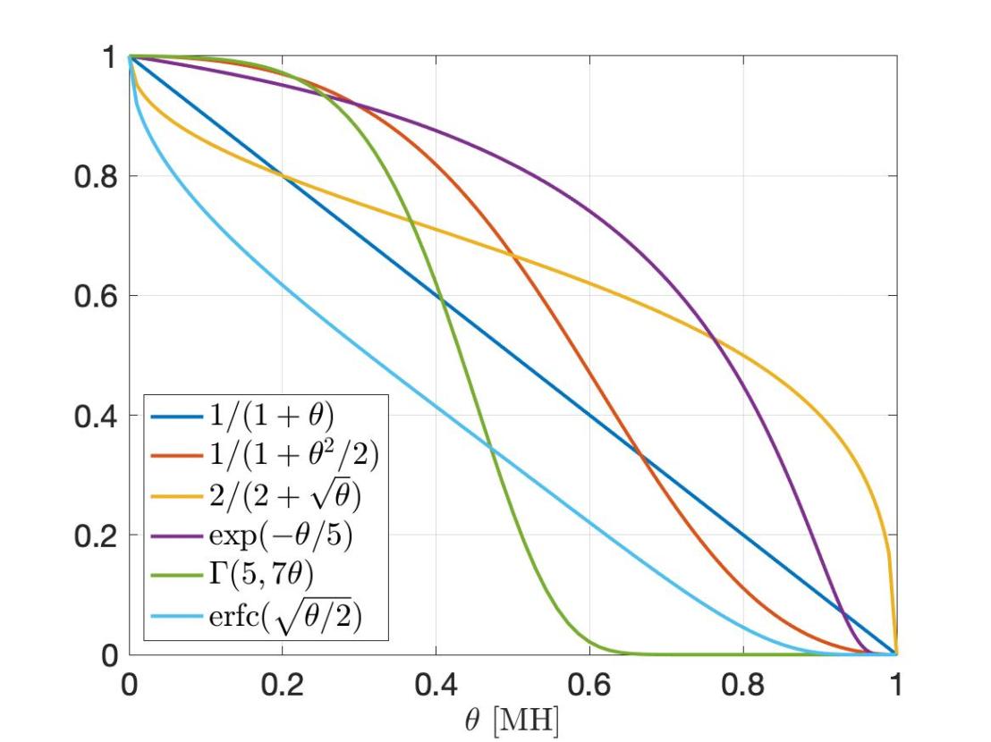
So how can we resolve these issues? It turns out that there is a straightforward solution. It is based on a homeomorphic mapping of [0,∞) to the unit interval [0,1]. This mapping is given by the function T(x)=x/(1+x), and the resulting scale is called MH (Möbius homeomorphic) scale. For comparison, the dB scale has the mapping 10 log10(x). In the figures below, the dummy variable is θ, and we have θ dB=10θ/10, and θ MH=θ/(1-θ). In the important high-reliability regime θ→0, θ MH ∼ θ, i.e., there is no distortion.
The three figures show 6 ccdfs on a linear, dB, and the MH scale. Clearly, the linear scale plots mask the information about the tail. Some curves go to zero (too) quickly, while the behavior of the yellow one past 100 is completely hidden. The dB scale displays the transitional regime more prominently, but all curves have an inverted S shape, which reduces the discriminative power of these plots. In particular, for small θ, they all become flat. For example, the blue (Pareto) and the cyan (Lévy) curve look similar in the dB scale, but with some shift. The MH scale, however, reveals that the asymptotic behavior on both ends is, in fact, quite different. Also, the red (another Pareto distribution) and green (gamma) curve look fairly similar in the dB scale, while the MH scale emphasizes the difference between the two. Generally, the MH plots enhance the differences because the slopes at 0 and at 1 can assume any value, while the slopes in the dB plots always approach 0 – assuming the range is chosen wide enough.
In summary, the MH scale has the following advantages:
- There is a single finite interval that reveals the complete distribution. There is never a question of what interval to choose, and nothing remains hidden.
- The asymptotic behaviors are clearly visible. In comparison, on the dB scale, the behavior near 0 and towards infinity is always obscured.
- In the case of SIRs, the MH scale has the additional interpretation as visualizing the distribution of the signal fraction S/(S+I) (SF) on a linear scale: If F(θ) is the ccdf of the SIR S/I, then F(T(θ)) is the ccdf of the SF.
The MH mapping and its application to SIRs and signal fractions was first introduced in the invited paper M. Haenggi, “SIR Analysis via Signal Fractions”, IEEE Communications Letters, vol. 24, pp. 1358-1362, July 2020.

3 thoughts on “Unmasking distributions with infinite support”