When applying simalysis as illustrated in the previous post, the question arises where to put the boundary between the part of the point process that is simulated and the part that is analyzed. Specifically, we may wonder whether we can reduce the simulated part to only a single point (on average), i.e., to choose the number of simulated points to be Poisson with mean 1 in each realization. Let’s find out, using the same Poisson bipolar model as in the previous post (Rayleigh fading, transmitter density 1, link distance 1/4).
Fig. 1. Simalysis of SIR ccdf for Poisson bipolar network averaged over 500 realizations with 1 point on average. The dashed curves show the exact results.
Fig. 1 shows the simulated (or, more precisely, simalyzed) result where the 500 realizations only contain one single point on average. This means that about 500/e ≈ 184 realizations have no point at all. We observe good accuracy, especially at small path loss exponents α. Also, the simulated curves are lower bounds to the exact ones. This is due to Jensen’s inequality:
The term on the left side is the exact factor in the SIR ccdf due to the interference Ic from points outside distance c. It is larger than the right side, which is the factor used in the simalysis (see the Matlab code). This property holds for all stationary point processes.
But why stop there? One would think that using, say, only 1/4 point on average would be (essentially) pointless. But let’s try, just to be sure.
Fig. 2. Same plot as in Fig. 1 but the curves are simalyzed with only 1/4 point per realization on average.
Remarkably, even with only 1/4 point per realization on average, the curves for α<2.5 are quite accurate, and the one for α=2.1 is an excellent lower bound! It is certainly much more accurate than a classical simulation with 500,000 points per realization (see the previous post). Such a good match is quite surprising, especially considering that 1/4 point on average means that about 78% of the realizations have 0 points, which means that in about 390 out of the 500 realizations, the simulated factor in the SIR ccdf simply yields 1. Also, in the entire simalysis, only about 125 points are ever produced. It takes no more than about 1/2 s on a standard computer. We conclude that accurate simulation (simalysis, actually) can be almost point-less.
Simulations can be quite time-consuming. Are there any techniques that can help make them more efficient and/or accurate? Let us focus on a concrete problem. Say we would like to plot the SIR distribution in a Poisson bipolar network for different path loss exponents α, including some values close to 2. Since we would like to compare the result with the exact one, we focus on the Rayleigh fading case where the analytical expression is known and simple. The goal is to get accurate curves for α=3, 2.5, 2.25, and 2.1, and we would like to wait no longer than 1 s for the results on a standard desktop or laptop computer. Let us first discuss why this is a non-trivial problem. It involves averaging w.r.t. the fading and the point process, and we need to make sure that the number of interferers is large enough for good accuracy. But what is “large enough”? A quick calculation using Campbell’s theorem (for sums) reveals that if we want to capture 99% of the mean interference power (outside radius 1 to avoid complications due to a potential singularity in the path loss law), we find that for α=3, the simulation region needs to be 100 times larger than for α=4. This seems manageable, but for α=2.5, 2.25, 2.1, it is 106, 1014, 1038 times larger, respectively! Clearly the straightforward approach of producing many realizations of the PPP in a large region does not work in the regime of small α. So how can we achieve our goal above – high accuracy and high efficiency?
The solution is to use an analysis-enhanced simulation technique, which I call simalysis. While we often tend to think as analysis vs. simulation as a dichotomy, in this approach they are used symbiotically. The idea is to exploit analytical results whenever possible to make simulations faster and more accurate. Let me illustrate how simalysis works when applied to the problem above.
For small α, it is impossible to “capture” most of the interference solely by simulation. In fact, most of it stems from the infinitely many distance nodes, each one contributing little, with independent fading. We can thus assume that the variance of the interference of the nodes further than a certain distance (relatively large compared with the mean nearest-neighbor distance) is relatively small. Accordingly, replacing it by its mean is a sensible simplification. Here is where the analysis comes in. For any stationary point process of density λ, the mean interference from the nodes outside distance c is
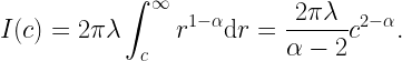
This interference term can then be added to the simulated interference, which stems from points within distance c. Simulating as few as 50 points is enough for very high accuracy. The result is shown in the figure below, using the MH scale so that the entire distribution is revealed (see this post for details on the MH scale). For α near 2, the curves are indistinguishable!
Fig. 1. SIR distribution for Poisson bipolar network in MH scale. Density 1, link distance 1/4. The solid lines are obtained by simalysis, the dashed lines show the exact analytical results.
This simulation averages over 500 realizations of the PPP and runs in less than 1 s on a laptop. The Matlab code is available here. It uses a second simalytic technique, namely the analytical averaging over the fading. Irrespective of the type of point process we want to simulate, as long as the fading is Rayleigh, we can perform the averaging over the fading analytically.
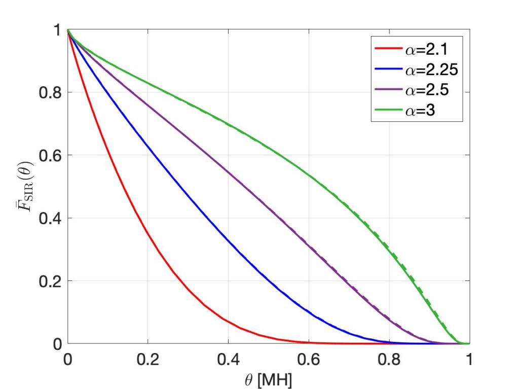
For comparison, the figure below shows the simulation results if 500,000 points (interferers) are simulated, without adding the analytical mean interference term, i.e., using classical simulation. Despite taking 600 times longer, the distributions for α<2.5 are not acceptable.
Fig. 2. Classically simulated SIR distribution (solid lines) in Poisson bipolar network, compared with the exact analytical ones (dashed). Same parameters as in Fig. 1.
Let us consider a hypothetical scenario that illustrates an issue I frequently observe.
Author: Here is an important result for a canonical Poisson bipolar network: Theorem: The complementary cumulative distribution of the SIR in a Poisson bipolar network with Rayleigh fading, transmitter density λ, link distance r, and path loss exponent 2/δ is
Proof: [Gives proof based on the probability generating functional.]
Reviewer:This is a nice result, but it is not validated by simulation. Please provide simulation results.
We have a proven exact analytical (PEA) result. So why would we need a simulation for “validation”? Where does the lack of trust in proofs come from? I am puzzled by these requests by reviewers. Similar issues arise when authors themselves feel the need to add simulations to the visualization of PEA results. Perhaps some reviewers are not familiar with the analytical tools used or they think it is easier to have a quick look at a simulated curve rather than checking a proof. Perhaps some authors are not entirely sure their proofs are valid, or they think reviewers are more likely to trust the proofs if simulations are also shown. The key issue is that such requests by reviewers or simulations by authors take simulation results as the “ground truth”, while portraying PEA results as weaker statements that need validation. This of course is not the case. A PEA result expresses a mathematical fact and thus does not need any further “corroboration”. Now, if the simulation results are accurate, the analytical and simulated curves lie exactly on top of each other, and the accompanying text states the obvious: “Look, the curves match!”. But what if there isn’t an exact match between the analytical and the simulated curve? Which means that the simulation is not accurate. Certainly that does not qualify as “validation”. The worst conclusion would be to distrust the PEA result and take the simulation as the true result. By its nature, a simulation is always restricted to a small cross-section of the parameter space. Even the simple result above has four parameters, which would make it hard to comprehensively simulate the network. Related, I am inviting the reader to simulate the result for a path loss exponent α=2.1 or δ=0.95. Almost surely the simulated curve will look quite different from the analytical one. In conclusion, there is absolutely no need for “two-step verification” of PEA results. On the contrary.
The fraction of reliable links is an important metric, in particular for applications with (ultra-)high reliability requirements. In the literature, we see that it is sometimes equated with the transmission success probability of the typical link, given by
This is the SIR distribution (in terms of the complementary cdf) at the typical link. In this post I would like to discuss whether it is accurate to call ps the fraction of reliable links.
Say someone claims “The fraction of reliable links in this network is ps=0.8″, and I ask “But how reliable are these links?”. The answer might be “They are (at least) 80% reliable of course, because ps=0.8.” Ok, so let us assume that the fraction links with reliability at least 0.8 is 0.8. Following the same logic, the fraction of links with reliability at least 0.7 would be 0.7. But clearly that fraction cannot be smaller than the fraction of links with reliability at least 0.8. There is an obvious contradiction. So how can we quantify the fraction of reliable links in a rigorous way?
First we note that in the expression for ps, there is no notion of reliability but ps itself. This leads to the wrong interpretation above that a fraction ps of links has reliability at least ps. Instead, we want so specify a reliability threshold so that we can say, e.g., “the fraction of links that are at least 90% reliable is 0.8”. Naturally it then follows that the fraction of links that are at least 80% reliable must be larger than (or equal to) 0.8. So a meaningful expression for the fraction of reliable links must involve a reliability threshold parameter that can be tuned from 0 to 1, irrespective of how reliable the typical link happens to be.
Second, ps gives no indication about the reliability of individual links. In particular, it does not specify what fraction of links achieve a certain reliability, say 0.8. It could be all of them, or 2/3, or 1/2, or 1/5. ps=0.8 means that the probability of transmission success over the typical link is 0.8. Equivalently, in an ergodic setting, in every time slot, a fraction 0.8 of all links happens to succeed, in every realization of the point process. But some links will be highly reliable, while others will be less reliable.
Before getting to the definition of the fraction of reliable links, let us focus on Poisson bipolar networks for illustration, with the following concrete parameters: link distance 1/4, path loss exponent 4, target SIR threshold θ=1, and the fading is iid Rayleigh. The link density is λ, and we use slotted ALOHA with transmit probability is p. In this case, the well-known expression for ps is
where c=0.3084 is a function of link distance, path loss exponent, and SIR threshold. We note that if we keep λp constant, ps remains unchanged. Now, instead of just considering the typical link, let us consider all the links in a realization of the network, i.e., for a given set of locations of all transceivers. The video below shows the histogram of the individual link reliabilities for constant λp=1 while varying the transmit probability p from 1.00 to 0.01 in steps of 0.01. The red line indicates ps, which is the average of all link reliabilities and remains constant at 0.735. Clearly, the distribution of link reliabilities changes significantly even with constant ps – as surmised above, ps does not reveal how disparate the reliabilities are. The symbol σ refers to the standard deviation of the reliability distribution, starting at 0.3 at p=1 and decreasing to less than 1/10 of that for p=1/100.
Histogram of link reliabilities in bipolar network.
Equipped with the blue histogram (or pdf), we can easily determine what fraction of links achieves a certain reliability, say 0.6, 0.7, or 0.8. These are shown in the plot below. It is apparent that for small p, due to the concentration of the link reliabilities as p→0, the fraction of reliable links tends to 0 or 1, depending on whether the reliability threshold is above or below the average ps .
Fraction of links achieving reliability at least 0.6, 0.7, 0.8.
So how do we characterize the link reliability distribution theoretically? We start with the conditional SIR ccdf at the typical link, given the point process:
Then ps=E(Ps), with the expectation taken over the point process. Hence ps is the mean of the conditional success probability, and if we consider its distribution, we arrive at the link reliability distribution, shown in blue in the video above. Mathematically,
where ν is the target reliability. This distribution is a meta distribution, since it is the distribution of a conditional distribution. In ergodic settings, it specifies the fraction of links that achieve an SIR of θ with reliability at least ν, which is exactly what we set out to quantify. In conclusion: The fraction of reliable links is not given by the standard (mean) success probability; it is given by the meta distribution of the SIR.
Alice has bits of viral information – so-called vitbits – to share. Despite her best efforts, she coughs up a strong signal and emits it using directional breathforming. Luckily, the line-of-sight is masked. Nearby Bob is unconcerned, he relies on an outage. After all, he is not in the near field, and he wouldn’t touch any of the non-intelligently reflecting surfaces in the room.
However, masking the main lobe of transmission leads to multi-path propagation and diversity. Waves of vitbits sitting on droplets (scientifically known as votons) are traveling along different paths, in an attempt to reach a destination. Their power decays quickly over distance, according to a power-law, with an empirical free-space limit of 2 m. But in this case, votons from different directions meet coherently, joining forces and managing to maintain strength and collectively carry sufficiently many vitbits.
Unfortunately, the vitbits find their target. There is no outage, just Bob’s outrage. He became a victim of his vir-ility.
Inspired by current events, let us focus on the “successful” transmission of a virus from one host to another. In the case of a coronavirus, such transmission happens when the infected person (the source) emits a “signal” by breathing, coughing, sneezing, or speaking, and another person (the destination) gets infected when the respiratory droplets land in the mouth or nose or are inhaled. Fundamentally, the process looks very similar to that of a conventional RF wireless transmission. There are notions of signal strength, directional transmission, path loss, and shadowing in both, resulting in a probability of “successful” reception. In both cases, distances play a critical role – there is the well-known 2 m separation in the case of coronaviral transmission that (presumably) causes an outage in the transmission with high probability; similarly, in the wireless case, there is sharp decay of reception probabilities as a function of distance due to path loss.
Given the critical role of the geometry of host (transceiver) locations, it appears that known models and analytical tools from stochastic geometry could be beneficially applied to learn more about the spread of an epidemic. In contrast to the careful modeling of channels and transmitter and receiver characteristics in wireless communications, the models for the spread of infectious diseases are usually based on the basic reproduction number R0, which is a population-wide parameter that reflects distances between individual agents very indirectly only. Since it is important to understand the effect of physical (Euclidean) distancing (often misleadingly referred to as “social distancing”) and masking (i.e., shadowing), it seems that incorporating distances explicitly in the models would increase their predictive power. Such models would account for the strong dependence of infection probabilities on distance, akin to the path loss function in wireless communications, as well as directionality, akin to beamforming. Time of proximity or exposure can be incorporated if mobility is included.
This line of thought raises some vital questions: How can expertise in wireless transmission be applied to viral transmission? What can stochastic geometry contribute to the understanding of how infectious diseases are spreading (spatial epidemics)? Is there a wireless analogy to “herd immunity”, perhaps related to percolation-theoretic analyses of how broadcasting over multiple hops in a wireless network leads to a giant component of nodes receiving an information packet?
I believe it is quite rewarding to think about these questions, both from a theoretical point of view and in terms of their real-world impact.
In the literature, the probability that the signal-to-interference ratio (SIR) at a given location and time exceeds a certain value is often referred to as the coverage probability. Is this sensible terminology, consistent with the way cellular operators define “coverage”? All publicly accessible cellular service coverage maps are static, i.e., their view of “coverage” is purely based on location and not on time. This seems natural since a rapidly changing coverage map, say at the level of seconds, would not be of much use to the user, apart from the fact that it would be very hard to collect the information at such time scales.
In contrast, the event SIR(x,t)>θ depends not only on the location x but also on the time t. A location may be “covered” at SIR level θ at one moment but “uncovered” just a little bit (one coherence time) later. Accordingly, a “coverage” map based on this criterion would have to be updated several times per second to accurately reflect this notion of coverage. Moreover, it would have to have a very high spatial resolution due to small-scale fading – one location may be “covered” at time t while another, half a meter away, may be “uncovered” at the same time t. Lastly, there is no notion of reliability. For each x and t, SIR(x,t)>θ either happens or not. It seems natural, though, to include reliability in a coverage definition; for example, by declaring that a location is covered if an SIR of θ is achieved with probability 95%, or 95 times out of 100 transmissions.
Hence there are three disadvantages of using SIR(x,t)>θ as the criterion for coverage:
The event depends on time (at the level of the coherence time)
The event depends on space at a very small scale (at the granularity of the coherence length of the small-scale fading)
The event does not allow for a reliability threshold to define coverage.
How can we define “coverage” without these shortcomings? First, we interpret coverage as a purely spatial term, consistent with the coverage maps we find on the web; it should not include a temporal component, at least not in the short-term – hopefully cellular coverage keeps improving over the years, but it should not vary randomly many times per second. Put differently, coverage should only depend on the network geometry (locations of base stations relative to the position x) and shadowing, but not on the rapid signal strength fluctuations due to small-scale fading. The solution to eliminate the temporal component is fairly straightforward – we just need to average over the temporal randomness, i.e., the small-scale fading. Such averaging eliminates the other two shortcomings as well. For a base station point process Φ, we define the conditional SIR distribution at location x as
Here, the probability is taken over the small-scale fading, which eliminates the dependence on time (assuming temporal ergodicity of the fading process, which means that the ensemble average here could be replaced by a time average over a suitable long period). If shadowing is present, it can be incorporated in Φ. Then, introducing a reliability threshold ν, we declare
The reliability threshold ν appears naturally in this definition. The probability that P(x)>ν is the meta distribution of the SIR, since it is the distribution of the conditional SIR distribution given Φ. For stationary and ergodic point processes Φ, it does not depend on x and gives the area fraction that is covered at SIR threshold θ and reliability threshold ν. The figure below shows a coverage map where the colors indicate the reliability threshold at which locations are covered, from dark blue (ν close to 0) to bright yellow (ν close to 1). So if P(SIR>θ) is not the coverage probability, what is it? It is simply the complementary cumulative distribution (ccdf) of the SIR, often interpreted as the success probability of a transmission.
Visualization of coverage at SIR threshold 1. Red dots indicate base stations. The colors indicate the reliability threshold. For example, for ν=0.8, regions colored orange and yellow are covered.
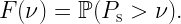
When visualizing distributions with infinite support, we face the challenge that they can only be shown partially. Usually we try to judiciously choose the interval of our plot so that the interesting part is revealed, and it is understood that outside that interval the function is essentially zero (for a density) or essentially zero or one (for a cumulative distribution). However, there are two disadvantages to that approach: First, if two distributions are not shown on the same interval, it is hard to compare them. Second, interesting asymptotic behavior in the tails are masked. In many cases, using a linear scale suffers from a third shortcoming: Interesting features may occur on a significantly different scale. Which would require choosing a large interval, but that, in turn, may mask the behavior in some parts.
When plotting distribution of signal-to-interference ratios (SIRs), the standard approach is to use a dB scale. The complementary cumulative distribution (ccdf) is usually interpreted as the success probability of a transmission (in an interference-limited setting). While the dB scale allows for visualization the cccdf over a larger range, it has its own shortcomings: First, it turns the one-sided infinite support [0,∞) into the two-sided infinite support (-∞,∞), which can make selecting a suitable interval harder. Second, it distorts the ccdf, which prevents the viewer from obtaining insight into asymptotic behaviors.
So how can we resolve these issues? It turns out that there is a straightforward solution. It is based on a homeomorphic mapping of [0,∞) to the unit interval [0,1]. This mapping is given by the function T(x)=x/(1+x), and the resulting scale is called MH (Möbius homeomorphic) scale. For comparison, the dB scale has the mapping 10 log10(x). In the figures below, the dummy variable is θ, and we have θ dB=10θ/10, and θ MH=θ/(1-θ). In the important high-reliability regime θ→0, θ MH ∼ θ, i.e., there is no distortion.
The three figures show 6 ccdfs on a linear, dB, and the MH scale. Clearly, the linear scale plots mask the information about the tail. Some curves go to zero (too) quickly, while the behavior of the yellow one past 100 is completely hidden. The dB scale displays the transitional regime more prominently, but all curves have an inverted S shape, which reduces the discriminative power of these plots. In particular, for small θ, they all become flat. For example, the blue (Pareto) and the cyan (Lévy) curve look similar in the dB scale, but with some shift. The MH scale, however, reveals that the asymptotic behavior on both ends is, in fact, quite different. Also, the red (another Pareto distribution) and green (gamma) curve look fairly similar in the dB scale, while the MH scale emphasizes the difference between the two. Generally, the MH plots enhance the differences because the slopes at 0 and at 1 can assume any value, while the slopes in the dB plots always approach 0 – assuming the range is chosen wide enough.
In summary, the MH scale has the following advantages:
There is a single finite interval that reveals the complete distribution. There is never a question of what interval to choose, and nothing remains hidden.
The asymptotic behaviors are clearly visible. In comparison, on the dB scale, the behavior near 0 and towards infinity is always obscured.
In the case of SIRs, the MH scale has the additional interpretation as visualizing the distribution of the signal fractionS/(S+I) (SF) on a linear scale: If F(θ) is the ccdf of the SIR S/I, then F(T(θ)) is the ccdf of the SF.
The MH mapping and its application to SIRs and signal fractions was first introduced in the invited paper M. Haenggi, “SIR Analysis via Signal Fractions”, IEEE Communications Letters, vol. 24, pp. 1358-1362, July 2020.
Figure 1. Six ccdfs on a linear scale.
Figure 2. Same ccdfs on a dB scale (corresponding to [0.01,100] in the linear scale).
Reading the literature, we often encounter sums of the form
for a point process Φ. This is an instance of what may be called “over-indexing”, since the subscript k is clearly not needed. It makes the notation unnecessarily cumbersome, but there is nothing mathematically wrong with it. If it is tacitly assumed that using a dummy variable of the form xk somehow defines k, problems arise. For instance, what exactly is meant by this formula?
To make this concrete, let us focus on this simple form:
What is the result? It is not 14 but undefined, since k is undefined. This problem occurs fairly frequently in the form
where h(k) is used to denotes a fading random variable indexed by some (undefined) k and f is a path loss function. What is meant is usually
Alternatively,
Here the fading random variables are indexed by the points, i.e., they can be interpreted as marks associated with the points. This is the form I personally prefer, for it does not require a particular way of indexing the points and it is more compact.
The concept of the typical point is important in point process theory. In the wireless context, it is often concretized to the typical user, typical receiver, typical vehicle, etc. The typical point is an abstraction in the sense that it is not a point that is selected in any deterministic fashion from the point process, neither is it an arbitrary point. Also, speaking of “a typical point” is misleading, since it suggests that there exist a number of such typical points in the process (or perhaps even in a realization thereof), and we can choose one of them to “obtain a typical point”. This does not work – there is nothing “typical” about a point selected in a deterministic fashion, let alone an arbitrary point. That said, if the total number of points is finite, we can, loosely speaking, argue that the typical point is obtained by choosing one of the points uniformly at random. Even this is not trivial since picking a point in a single realization of the point process does generally not produce the desired result, for example of the point process is not ergodic. Many realizations need to be considered, but then the question arises how exactly to pick a point uniformly from many realizations. If the number of points is infinite, any attempt of picking a point uniformly at random is bound to fail because there is no way to select a point uniformly from infinitely many, in much the same way that we cannot select an integer uniformly at random.
So how do we arrive at the typical point? If the point process is stationary and ergodic, we can generate the statistics of the typical point by averaging those of each individual point in a single realization, observed in an increasingly large observation window. This leads to the interpretation of the typical point as a kind of “average point”. Similarly, we may find that the “typical American male” weighs 89.76593 kg, which does not imply that there exists an individual with that exact weight but means that if we weighed every(male)body or a large representative sample, we would obtain that average weight. For general (stationary) point processes, we obtain the typical point by conditioning on a point to exist at a certain location, usually the origin o. Upon averaging over the point process (while holding on to this point at the origin), that point becomes the typical point. The distribution of this conditioned point process is the Palm distribution. In the case of the Poisson process, conditioning on a point at o is the same as adding a point at o. This equivalence is called Slivnyak’s theorem.
In the non-stationary case, the typical point at location x may have different statistical properties than the typical point at another location y. As a result, there exist Palm measures (or distributions) for each location in the support of the point process. In this case, the formal definition of the Palm measure is given by the Radon-Nikodym derivative (with respect to the intensity measure) of the Campbell measure. In the Poisson case, Slivnyak’s theorem still applies.