Randomness decreases correlation – does it?

Intuition may tell us that increasing the randomness in the system (e.g., by increasing the variance of some random variables relative to their mean) will decrease the correlation between some random quantities of interest. A prominent example is the interference or SIR in a wireless network measured at two locations or in two time slots.

Let us consider a simple example to explore whether this intuition is correct. We consider the two random variables XY1 and XY2, where Y1 and Y2 are iid exponential with mean 1 and X is Bernoulli with mean p, independent of the Yk. In this case, Pearson’s correlation coefficient is

\displaystyle \rho(p)=\frac{p-p^2}{2p-p^2}.

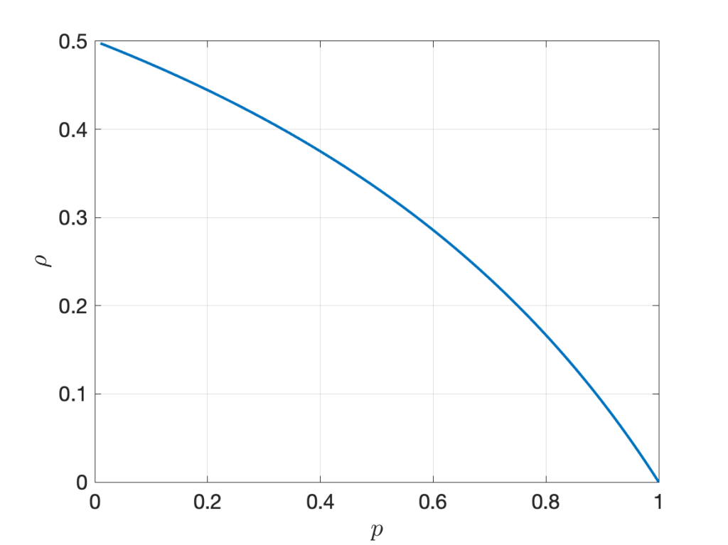
It is illustrated in Figure 1 below. The randomness in X, measured by the ratio of variance to mean, is 1-p . However, increasing the randomness monotonically increases the correlation. As p approaches 0, the correlation tends to its maximum of 1/2.

Figure 1: Correlation coefficient of XY1 and XY2 where X is Bernoulli(p) and Yk are iid exponential(1).

Next, let Y1 and Y2 be independent and Bernoulli with mean p and X gamma distributed with parameters m and 1/m, such that the mean of X is 1 and the variance 1/m. Again we focus on the correlation of the two products XY1 and XY2. In this case, the correlation coefficient is

\displaystyle \rho(p,m)=\frac{p^2}{p(1+m)-m p^2},

shown in Figure 2 below for different values of m. Again, we observe that increasing the randomness in X (decreasing m) increases the correlation for all p <1. For p =1, the correlation is 1 since both random variables equal X.

Figure 2: Correlation coefficient of XY1 and XY2 where X is gamma(m,1/m) and Yk are iid Bernoulli(p).

So is the relationship between randomness and correlation completely counter-intuitive? Not quite, but our intuition is probably skewed towards the case of independent randomness, as opposed to common randomness. In the second example, the randomness in Y1 and Y2 decreases with p, and the correlation coefficient increases with p, as expected. Here Y1 and Y2 are independent. In contrast, X is the common randomness. If its variance increases, the opposite happens – the randomness decreases.

In the wireless setting, the common randomness is often the point process of transceiver locations, while the independent randomness usually comprises the fading coefficients and the channel access indicators. One of the earliest results on correlations in wireless networks is the following: For transmitters forming a PPP, with each one being active independently with probability p in each time slot (slotted ALOHA) and independent Nakagami-m fading, the correlation coefficient of the interference measured at the same location in two different time slots is (see Cor. 2 in this paper)

\displaystyle \qquad\qquad\qquad\qquad\qquad\rho(p,m)=\frac{pm}{m+1}.\qquad\qquad (*)

Here the fading coefficients have the same gamma distribution as in the second example above. As expected, increasing the randomness in the channel access (decreasing p) and in the fading (decreasing m) both reduce the correlation. Conversely, setting p =1 and letting m → ∞, the correlation coefficient is 1. However, the correlation is induced by the PPP as the common randomness – if the node placement was deterministic, the correlation would be 0. In other words, the interference in different times slots is conditionally independent given the PPP. This conditional independence is exploited in the analysis of important metrics such as the local delay and the SIR meta distribution.

One last remark. The expression (*) shows that the correlation coefficient is simply the product of the transmit probability p and the Nakagami fading parameter m mapped to the (0,1) interval using the Möbius homeomorphic transform described here, which is m /(m+1). This shows a nice symmetry in the impact of channel access and fading.

Rayleigh fading and the PPP – part 2

The previous blog highlighted that the Rayleigh fading channel model and the Poisson deployment model are very similar in terms of their tractability and in how realistic they are. It turns out that Rayleigh fading and the PPP are the neutral cases of channel fading and node deployment, respectively, in the following sense:

  • For Rayleigh fading, the power fading coefficients are exponential random variables with mean 1, which implies that the ratio of mean and variance is 1. If the ratio is smaller (bigger variance), the fading is stronger. If the variance goes to 0, there is less and less fading.
  • For the PPP, the ratio of the mean number of points in a finite region to its variance is 1. If the ratio is larger than 1, the point process is sub-Poissonian, and if the ratio is less than 1, it is super-Poissonian.

Prominent examples of super-Poissonian point processes are clustered processes, where clusters of points are placed at the points of a stationary parent process, and Cox processes, which are PPPs with random intensity measures. Sub-Poissonian processes include hard-core processes (e.g., lattices or Matérn hard-core processes) and soft-core processes (e.g., the Ginibre point process or other determinantal point processes, or hard-core processes with perturbations).

There is no convenient family of point process where the entire range from lattice to extreme clustering can be covered by tuning a single parameter. In contrast, for fading, Nakagami-m fading represents such a family of models. The power fading coefficients are gamma distributed with parameters m and 1/m, i.e., the probability density function is

\displaystyle f(x)=\frac{m^m}{\Gamma(m)}x^{m-1}e^{-mx}

with variance is 1/m. The case m =1 is the neutral case (Rayleigh fading), while 0<m <1 is strong (super-Rayleigh) fading, and m >1 is weak (sub-Rayleigh) fading. The following table summarizes the different classes of fading and point process models. NND stands for the nearest-neighbor distance of the typical point.

fadingpoint process
rigidno fading (m → ∞)lattice (deterministic NND)
weakly randomm >1 (sub-Rayleigh)repulsive (sub-Poissonian)
neutralm =1 (Rayleigh)PPP
strongly randomm <1 (super-Rayleigh)clustered (super-Poissonian)
extremely randomm → 0clustered with mean NND → 0
(while maintaining density)

It is apparent that the Rayleigh-PPP model offers a good balance in the amount of randomness – not too weak and not too strong. Without specific knowledge on how large the variances in the channel coefficients and in the number of points in a region are, it is the natural default assumption. The other key reason why the combination of exponential (power) fading and the PPP is so symbiotic and popular is its tractability. It is enabled by two properties:

  • with Rayleigh fading in the desired link, the SIR distribution is given by the Laplace transform of the interference;
  • the Laplace transform, written as an expected product over the points process, has the form of a probability generating functional, which has a closed-form expression for the PPP.

The fading in the interfering channels can be arbitrary; what is essential for tractability is only the fading in the desired link.

Rayleigh fading and the PPP

When stochastic geometry applications in wireless networking were still in their infancy or youth, I was frequently asked “Do you believe in the PPP model?”. I usually answered with a counter-question:“Do you believe in the Rayleigh fading model?”. This “answer” was motivated by the high likelihood that the person asking
was

  • familiar with the idea of modeling the effects of multi-path propagation using Rayleigh fading;
  • found it not only acceptable but quite natural to use a model with obvious shortcomings and limitations, for the sake of analytical tractability and design insight.

It usually turned out that the person quickly realized that the apparent shortcomings of the PPP model are quite comparable to those of the Rayleigh fading model, and that, conversely, they both share a high level of tractability.

Surely if one can accept that wireless signals propagate along infinitely many paths of comparable propagation loss with independent phases, resulting in a random received power with infinite support, one can accept a point process model with infinitely many points that are, loosely speaking, independently placed. If one can accept that at 0 dBm transmit power, there is a positive probability that the power received over a 1 km distance exceeds 90 dBm (1 MW), then surely one can accept that there is a positive probability that two points are separated by only 1 cm.

So why is it that Rayleigh fading was (and perhaps still is) more acceptable than the PPP? Is it just that Rayleigh fading has been used for wireless channel modeling for much longer than the PPP? Perhaps. But maybe part of the answer lies in what prompts us to use stochastic models in the first place.

Fundamentally there is no randomness in wireless propagation. If we know the characteristics of the antennas and the locations and properties of all objects, we can calculate the channel parameters exactly (say by raytracing) – and if there is no mobility, the channel stays fixed forever. So why introduce randomness where there is none? There are two reasons:

  • Raytracing is computationally expensive
  • The results obtained only apply to one very specific scenario. If a piece of furniture is moved a bit, we need to start from scratch.

Often the goal is to design a communication architecture, but such design cannot be based on the layout of a specific room. So we need a model that captures the characteristics of the channels in many rooms in many buildings, but obtaining such a large data set would be very expensive, and it would be hard to derive any useful insight from it. In contrast, a random model offers simplicity and superior tractability.

Similarly, in a network of transceivers, we could in principle assume that all their locations (and mobility vectors) are known, plus their transmit powers. Then, together with the (deterministic) channels, the interference power would be a deterministic quantity. This is very impractical and, as above, we do not want to decide on the standards for 7G cellular networks based on a given set of base station and user (and pet and vacuum robot and toaster and cactus) locations. Instead we aim for the robust design that a random spatial model (i.e., a point process) offers.

Another aspect here is that the channel fading process is often perceived (and modeled) as a random process in time. Although any temporal change in the channel is but a consequence of a spatial change, it is convenient to disregard the purely spatial nature of fading and assume it to be temporal. Then we can apply the standard machinery for temporal random processes in the performance analysis of a link. This includes, in particular, ergodicity, which conveniently allows us to argue that over some time period the performance will be close to that predicted by the ensemble average. The temporal form of ergodicity appears to be much more ingrained in our thinking than its spatial counterpart, which is at least as powerful: in an ergodic point process, the average performance of all links in each realization corresponds to that of the typical link (in the sense of the ensemble average). In the earlier days of stochastic geometry applications to wireless networks this key equivalence was not well understood – in particular by reviewers. Frequently they pointed out that the PPP model (or any point process model for that matter) is only relevant for networks with very high mobility, believing that only high mobility would justifiy the ensemble averaging. Luckily this is much less of an issue nowadays.

So far we have discussed Rayleigh fading and the PPP separately. The true strength of these simple models becomes apparent when they are combined into a wireless network model. In fact, most of the elegant closed-form stochastic geometry results for wireless networks are based on (or restricted to) this combination. There are several reason for this symbiotic relationship between the two models, which we will explore in a later post.

A case for T junctions

It has been established (for example, here) that the standard two-dimensional homogeneous PPP is not an adequate model for vehicular networks, since vehicles are mostly confined to streets. The Poisson line Cox process (PLCP) has naturally emerged as the model of choice. In this process, one-dimensional PPPs are placed on a street system formed by a Poisson line process. This model is somewhat tractable and thus has gained some traction in the community. With probability 1 each line (or street) intersects with each other line, so intersections are formed, and the communication performance at the typical intersection vehicles can be studied. This is important since vehicles at intersections are more accident-prone than other vehicles.

How about T junctions? Clearly, the PLCP has no T junctions a.s. But while not quite as frequent as (four-way) intersections, they are an important building block of the street systems in every city, and it is reasonable to assume that they inherit some of the dangers of intersections. However, the performance of vehicles at T junctions have barely been modeled and analyzed. The reason is perhaps not that it is not worthy of study but the lack of a natural model. Let’s say we wanted to construct a Cox model of vehicles that is supported on a street system that has no intersections but only T junctions, with the T junctions themselves forming a stationary point process (in the same way the intersections in the PLCP form a stationary point process). What is the simplest (most natural, most tractable) model?

One model we came up with is inspired by the so-called lilypond model. From each point of a PPP, a line segment grows in a random orientation in both directions. All segments grow at the same speed until one of their endpoints hit another segment. Once all growth has stopped, the lilypond street model is obtained. Here is a realization:

Figure 1. Realization of Lilypond street model, starting with a PPP of density 0.1.

Then PPPs of vehicles can be placed on each line segment to form a Lilypond line segment Cox process. Some results for vehicular networks based on this model are available here. The model has the advantage that it has only a single parameter – the density of the underlying PPP of the center points of each line segment. On the other hand, the distribution of the length of the line segments can only be bounded, and the construction naturally creates a dependence between the lengths of nearby segments, which limits the tractability. For instance, in a region with many initial Poisson points, segments will be short on average, while in a region with sparse Poisson points, segments will be long. Also, the construction implies that simulating this process takes significantly more time than simulating a PLCP.

Given the shortcoming of the model, it seems quite probable that there are other, simpler and (even) more natural models for street systems with T junctions. Let’s try and find them!

The typical user and her malfunctioning base station

Let us consider a cellular network with Poisson distributed base stations (BSs). We assume that in each Voronoi cell, one user is located uniformly at random (and independently across cells), and, naturally, the user is connected to the nucleus of that cell. This is the user point process of type I defined in this article. In this case, the typical user, named Alice, does reside in the typical cell since there is no size-biased sampling involved in defining the typical user. The downlink SIR performance of this network has been analyzed here (SIR distribution) and here (SIR meta distribution).

Suddenly and unfortunately, Alice’s serving BS is malfunctioning. Her downlink is, well, down, and she gets reconnected to the next-nearest one. How does that affect her SIR performance?
In another network, also with Poisson BSs, lives another type of typical user, namely that of a stationary point process of users that is independent of the base station process. This typical user’s name is Bob. Bob’s SIR performance is the same as the one measured at an arbitrary deterministic location on the plane, as discussed in this post. He resides in the 0-cell, not the typical cell. So in his case, the typical user does not reside in the typical cell.

Noticing that Alice’s original BS ceased to operate, Bob says: “I think now your SIR performance is the same as mine. After all, your cell was formed by adding a BS at the origin, while my network has no such BS. With that added BS removed, we are in the same situation.

Alice responds: “You may have a point, but I am not sure that my location is uniform in the 0-cell, as yours is.”

Bob: “Good point, but wouldn’t that be the natural conjecture?

Alice: “I am not sure. How about we verify? Let’s look at the distances.”

Bob: “Ok. For me, if Bn is the distance to my n-th nearest BS, we have

\displaystyle \pi\mathbb{E}(B_n^2)=n.

Alice: “For me, the distance A1 to the malfunctioning BS satisfies π𝔼(A12)≈10/13, by the properties of the typical cell. If you are correct, then the distribution of A2 should be the same as that of B1. But that’s not the case, see this figure.

Mean squared distances times π. For Alice, the distances are An, for Bob, Bn.

Bob: “I see – your new serving BS at distance A2 is quite a bit further away than mine at B1. So my conjecture was wrong.

Alice: “Yes, but the question of how resilient a cellular network is to BS outages is an interesting one. How about we compare the SIR performance with and without BS outage in different networks, say Poisson networks and lattice networks? I bet Poisson networks are more robust, in the sense that the downlink SIR statistics change less when there is an outage and users need to be handed off to the next-nearest BS.

Bob: “Hmm… that would make sense. But would that mean we should build clustered networks, to achieve even higher robustness?

Alice: “Possibly – if all we worry about is a small loss when a user is offloaded. But we should take into account the absolute performance also, and clustered networks are worse in this regard. If the starting performance is much higher, it is acceptable to have a somewhat bigger loss due to outage and handover.

Bob: “Makes sense. Sorry, I have to go. My SIR is so high that I just got a phone call.

Percentage games

Let us consider a hypothetical situation where the authors of a paper promise the following:

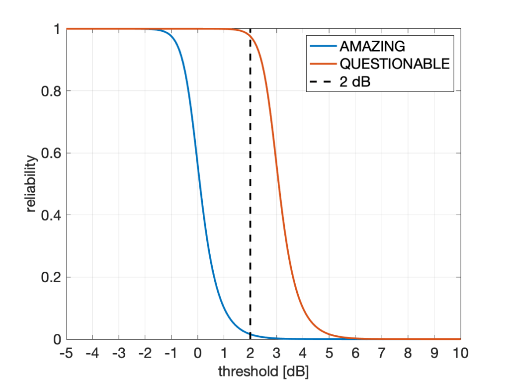
In the next figure, we compare our Quantum Ultra-Enhanced Superior-Throughput Intelligent Objectively-Novel Adaptive Beamformed Low-Latency Emission (QUESTIONABLE) scheme with the Arbitrarily-Massive Antenna Zero-Innovation Neural Grandiloquence (AMAZING) scheme, which is the best previously known scheme. As the figure shows, the QUESTIONABLE scheme outperforms the AMAZING scheme by 6122% at a threshold of 2 dB.”

They refer to this figure:

Fig. 1: Fair comparison of our QUESTIONABLE scheme with the AMAZING scheme reported elsewhere. As is clearly apparent, the reliability gain at 2 dB is very high, unquestionably.

A gain of more than 6,000% sounds, well, amazing. But it also questionable: Is it good practice to state this figure of 6122%? Is it good marketing? Is it acceptable? Should it be discouraged? Is it even unethical?
If claiming 6122% at 2 dB is acceptable, how about a 25119% gain at 10 dB? Here the absolute reliability of AMAZING is 6.3e-9, and that of QUESTIONABLE is 1.60e-6. Not a practical regime, but a more than 25000% gain nonetheless.

Conversely, at -1.5 dB, the improvement is from 0.996 (which is AMAZING) to 0.9999999 (which is QUESTIONABLE). This is a modest 0.4% improvement both in absolute and relative terms. However, focusing on outage instead of reliability, the factor between the two outage probabilities is 62763, or 6,276,267%. So the 0.4% gap becomes a 6M% gap (that’s mega-percent, admittedly an usual combination of a metric prefix with a unit).

Independently of such amazing and questionable transmission schemes, is an improvement from 10% to 13% a 3% improvement or a 30% improvement? Frequently we see such a gain reported as a 30% improvement. Is it fair to use the ratio to measure improvement, or should it be the gap (difference)? Equivalently, should the percentage improvement be measure in percent of the underlying quantity (in which case it is 3%) or in percent of the percentages (in which case it is 30%)? The problem is that terms like “gain”, “increase”, “improvement”, “boost”, “raise” are imprecise as they may refer to differences or ratios.

How about an improvement from 10 dB to 13 dB? Here, most people would agree that the gain is 3 dB. The reason why there is no ambiguity here is that 3 dB is both the difference 13 dB-10 dB and also the ratio of the underlying quantities expressed in dB, 20/10. Thanks to the logarithm in the dB scale, both lead to the same result. With percentages, this is not the case.

The ambiguity also manifests itself when we compare percentages with physical units such as meters or seconds. The difference between 10 m and 13 m is 3 m, and 13 m is 30% longer than 10 m. Percentage gains always measure ratios in this case. But if “meter” is replaced by “percent”, the situation becomes murky. By analogy then the difference between 10% and 13% is 3%, so 13% is 3% more than 10%, in the same way that 13 m is 3 m more than 10 m. But at the same time, 13% is 30% more than 10%, in the same way that 13 m is 30% more than 10 m.

So how do we resolve this? Here are some suggestions:

  • Always state whether we refer to ratios or difference. For instance, instead of saying “The increase is 30%” say the “increase is a factor of 1.3 or 30%”.
  • Avoid ambiguity by using fractions instead of percentages. For instance, the difference between 0.1 and 0.13 is 0.03, and the ratio is 1.3.
  • Avoid aggressive marketing when quantities are in very impractical regimes. For instance, in the example above, advertising huge gains at reliabilities below 1e-5 is not good practice. Conversely, in regimes of interest, such as the high-reliablity regime, it is perfectly acceptable to report a gain of 100 in the outage performance if the outage probability is reduced from 0.01 to 0.0001. (However, talking about 10,000% is not recommended.)
  • Consider using horizontal distances (gaps) instead of vertical ones. Especially with steep (almost step-like) curves like the one in Fig. 1, the vertical gap strongly depends on where it is measured along the x axis. Conversely, the horizontal gap may be fairly constant. In the case of Fig. 1, the horizontal gap is, in fact, constant. It is exactly 3 dB at all reliabilities. A quasi-constant gap is often observed in SIR distributions (cdfs) of cellular networks when different transmission schemes are compared. The theory behind is explained in this letter (here on IEEE Xplore) and in this paper (here on IEEE Xplore). In this case, the gains are either factors (in linear scale) or gaps (in the dB) scale. This method of reporting gains is the one adopted by the coding theory community – coding gains are reported in dB (horizontally), not as gains in the bit error performance (vertically).

On cell slicing

Network slicing is a warm topic these days. Here we discuss cell slicing, where a polygon is cut in three pieces (sub-polygons) by two lines through its nucleus and a random point, respectively. First, as a sequel to this post, we focus on the 0-cell in the Poisson-Voronoi tessellation, which is the Voronoi cell of a PPP that contains the origin.
As in that earlier post, we rotate and shift the 0-cell so that its nucleus is at the origin and the point located uniformly randomly in the cell is to the right (on the positive x axis). In a cellular network application, the nucleus (now at the origin) is the location of the base station, while the random point is the typical user. Then we draw vertical lines through the origin and the random point and calculate the areas of the polygons to the left of the origin and to the left of the random point. This movie shows a number of realizations of this setup:

Movie 1. Realizations of 0-cells in Poisson-Voronoi tessellation sliced into three sub-polygons.

For intensity λ=1, the 0-cell in the Poisson-Voronoi tessellation has a mean area of 1.280176, obtained by the numerical evaluation of an integral. The polygon to the left of the nucleus o, shown in green in the movie, has a mean area of 0.517649, also obtained by numerical integration. The red polygon, to the right of o and to the left of x, has a mean area of 0.529111, obtained by simulation. Relative to the total mean area, we thus have:

  • Mean area to the left of o: 40.4%
  • Mean area to the left of x: 81.8%
  • Mean area to the right of x: 18.2%

Hence, on average, almost 60% of the (other) users in the cell are on the same side of the base station as the typical user, and the mean area to the left of the typical user is larger than the entire mean area of the typical cell (which is 1 for λ=1). Also, more than 18% of the users are “behind” the typical user.

Not surprisingly, the area fractions are quite similar in the typical Poisson-Voronoi cell. (Note that the uniformly random point in the typical cell does not correspond to the typical user of a user point process that is independent of the base station process – see this post). These percentages (area fractions) for the typical cell are all simulated:

  • Mean area to the left of o: 39.8%
  • Mean area to the left of x: 81.3%
  • Mean area to the right of x: 18.7%

How unusual are these area fractions? Let us compare them with those in the disk, which is, in some sense, the ideal cell shape. In the disk, with the nucleus o at the center, the mean area fraction to the left of o is trivially 1/2, while the area to the left of a uniformly random point is easily determined to be 7/8. This shows that the (roughly) 2/5 – 2/5 – 1/5 split in the typical Poisson-Voronoi cells is relatively far from the 1/2 – 3/8 – 1/8 split of the disk. How about regular polygons with a finite number of sides? The second movie shows some realizations for 3,4, … ,10,12,15,20,32 sides.

Movie 2. Realizations of regular polygons sliced into three sub-polygons.

As expected, for a larger number of sides the area fractions approach those of the disk. Here is a plot of the relative deviations to the disk of regular polygons, where o is the centroid:

Figure 1. Percentage deviation of mean areas left of o and left of x in regular polygons relative to the disk.

For instance, for the triangle, the area fraction to the left of o is 0.516, which is 3.2% larger than for the disk. Hence the first blue point in Fig. 1 (top left), corresponding to 3 sides, is at 3.2. To better see how the deviations behave for 5 or more sides, here is another version of the figure that shows only pentagons and higher.

Figure 2. Same as Fig. 1 but starting at pentagons.

From the blue curve it is apparent that the area to the left of the center is always exactly one half if the number of sides is even. The reason is that with an even number of sides, the polygons to the left of o and to the right of o are always congruent irrespective of the location of the random point. We also see that the hexagon is quite close to the disk already, with a mere 0.15% deviation from the 7/8 area fraction (to the left of x) of the disk.

Averages, distributions, and meta distributions

In this post I would like to show how meta distributions naturally emerge as an important extension of the concepts of averages and distributions. For a random variable Z, we call 𝔼(Z) its average (or mean). If we add a parameter z to compare Z against and form the family of random variables 1(Z>z), we call their mean the distribution of Z (to be precise, the complementary cumulative distribution function, ccdf for short).
Now, if Z does not depend on any other randomness, then 𝔼1(Z>z) gives the complete information about all statistics of Z, i.e., the probability of any event can be expressed by adding or subtracting these elementary probabilities.
However, if Z is a function of other sources of randomness, then 𝔼1(Z>z) does not reveal how the statistics of Z depend on those of the individual random elements. In general Z may depend on many, possibly infinitely many, random variables and random elements (e.g., point processes), such as the SIR in a wireless network. Let us focus on the case Z=f(X,Y), where X and Y are independent random variables. Then, to discern how X and Y individually affect Z, we need to add a second parameter, say x, to extend the distribution to the meta distribution:

\displaystyle \bar F_{[\![Z\mid Y]\!]}(z,x)=\mathbb{E}\mathbf{1}(\mathbb{E}[\mathbf{1}(Z>z) \mid Y]>x).

Alternatively,

\displaystyle \bar F_{[\![Z\mid Y]\!]}(z,x)=\mathbb{E}\mathbf{1}(\mathbb{E}_X\mathbf{1}(Z>z)>x).

Hence the meta distribution (MD) is defined by first conditioning on part of the randomness. It has two parameters, the distribution has one parameter, and the average has zero parameters. There is a natural progression from averages to distributions to meta distributions (and back), as illustrated in this figure:

Figure 1: Relationship between mean (average), ccdf (distribution), and MD (meta distribution).

From the top going down, we obtain more information about Z by adding indicators and parameters. Conversely, we can eliminate parameters by integration (taking averages). Letting U be the conditional ccdf given Y, i.e., U=𝔼X1(Z>z)=𝔼[1(Z>z) | Y], it is apparent that the distribution of Z is the average of U, while the MD is the distribution of U.

Let us consider the example Z=X/Y , where X is exponential with mean 1 and Y is exponential with mean 1/μ, independent of X. The ccdf of Z is

\displaystyle \bar F_{Z}(z)=\frac{\mu}{\mu+z}.

In this case, the mean 𝔼(Z) does not exist. The conditional ccdf given Y is the random variable

\displaystyle U=\bar F_{Z\mid Y}(z)=\mathbb{E}\mathbf{1}(Z>z\mid Y)=e^{-Yz},

and its distribution is the meta distribution

\displaystyle \bar F_{[\![Z\mid Y]\!]}(z,x)\!=\!\mathbb{P}(U\!>\!x)\!=\!\mathbb{P}(Y\!\leq\!-\log(x)/z)\!=\!1\!-\!x^{\mu/z}.

As expected, the ccdf of Z is retrieved by integration over x∈[0,1]. This MD has relevance in Poisson uplink cellular networks, where base stations (BSs) form a PPP Φ of intensity λ and the users are connected to the nearest BS. If the fading is Rayleigh fading and the path loss exponent is 2, the received power from a user at an arbitrary location is S=X/Y, where X is exponential with mean 1 and Y is exponential with mean 1/(λπ), exactly as in the example above. Hence the MD of the signal power S is

\displaystyle \qquad\qquad\qquad\bar F_{[\![S\mid \Phi]\!]}(z,x)=1-x^{\lambda\pi/z}.\qquad\qquad\qquad (1)

So what additional information do we get from the MD, compared to just the ccdf of S? Let us consider a realization of Φ and a set of users forming a lattice (any stationary point process of users would work) and determine each user’s individual probability that its received power exceeds 1:

Figure 2: Realization of a Poisson cellular network of density 1 where users (red crosses x) connect to the nearest base station (blue circles o). The number next to each user u is ℙ(Su>1 | Φ).

If we draw a histogram of all the user’s probabilities (the numbers in the figure), how does it look? This cannot be answered by merely looking at the ccdf of S. In fact ℙ(S>1)=π/(π+1)≈0.76 is merely the average of all the numbers. To know their distribution, we need to consult the MD. From (1) the MD (for λ=1 and z=1) is 1-xπ. Hence the histogram of the numbers has the form of the probability density function πxπ-1. In contrast, without the MD, we have no information about the disparity between the users. Their personal probabilities could all be well concentrated around 0.76, or some could have probabilities near 0 and others near 1. Put differently, only the MD can reveal the performance of user percentiles, such as the “5% user” performance, which is the performance that 95% of the users achieve but 5% do not.
This interpretation of the MD as a distribution over space for a fixed realization of the point process is valid whenever the point process is ergodic.

Another application of the MD is discussed in an earlier post on the fraction of reliable links in a network.